Eashan Mehta

Many business owners assume that all their website needs is a fresh coat of paint — a sleeker layout, updated fonts, maybe a new color scheme. No need for extra features or deeper strategy — just something that looks better than what they had before. But that mindset is where most eCommerce websites fall short.
In today’s digital world, it’s easier than ever to launch a eCommerce website in a weekend. But just because you can launch quickly doesn’t mean it will work effectively. A good eCommerce website isn’t just about appearance — it’s about performance. It should guide visitors, build trust, and convert traffic into real sales.
We see this all the time: a brand hires a cheap agency to get a site live fast, only to come back to us months later because it’s not converting. Why? Because the site may look decent on the surface, but under the hood, it’s missing the structure that actually drives growth.
The truth is, great design goes beyond visuals. It’s about creating a seamless customer experience. Are your product pages displaying trust signals? Do you have visible reviews? A sticky cart? Fast load times? These small details quietly do the heavy lifting.
In this blog, we’ll break down what a truly effective eCommerce website looks like — with real examples, critical features you might be overlooking, and simple improvements you can apply to your store today.
First Impressions Matter: Clean, On-Brand eCommerce Website Design
You only get a few seconds to make a strong first impression — and in eCommerce, that starts with your homepage. If your site looks cluttered, outdated, or confusing, potential customers will bounce before they ever browse your products.
A high-performing eCommerce site doesn’t just look “nice” — it looks intentional. Branding should be consistent across your homepage and throughout your site: colors, fonts, logos, and messaging should all feel aligned. When these elements work together, they build trust and credibility — especially for new visitors.
Equally important is functionality. Your site needs to be responsive on both desktop and mobile. With more than half of shoppers browsing on their phones, your mobile experience must be fast, intuitive, and glitch-free. A beautiful desktop layout won’t matter if mobile users are stuck zooming, scrolling, or waiting for pages to load.
Pro tip: Take a moment and look at your homepage on your phone. Does it load quickly? Is it easy to navigate? Does it reflect your brand clearly? If not, that’s your first red flag.
Clear Navigation That Guides the eCommerce Website Journey
If shoppers can’t find what they’re looking for in a few clicks, they won’t stick around. Navigation isn’t just about menus — it’s about guiding users through your site in a way that feels smooth and natural.
Start with a simple, intuitive menu. Group categories logically and use clear labels. For stores with large catalogs, mega menus can help surface high-priority categories without overwhelming the shopper. Add filters to help users narrow results, and make sure your search bar isn’t just there — it works.
Site search is one of the most powerful tools on any eCommerce website. When someone searches, they’re showing clear buying intent — so your search feature should be fast, relevant, and typo-tolerant. Tools like Searchanise can enhance your on-site search by adding smart filters, real-time suggestions, and even personalized results that boost conversions.
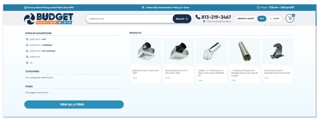 Budgetheating.com Searchanise Dynamic Search Example
Breadcrumb trails and “back” functionaliety also make a difference. Let users easily retrace their steps and explore without getting lost.
Remember: the fewer clicks it takes to find a product, the higher the chance they’ll buy.
Easy Checkout Experience (No Surprises)
The checkout process should feel effortless. The more steps a customer has to take, the more likely they are to abandon their cart.
Offer guest checkout so buyers don’t have to create an account just to make a purchase. Use auto-fill to save time, and include a progress bar so they know how many steps are left. These small UX upgrades can make a huge difference.
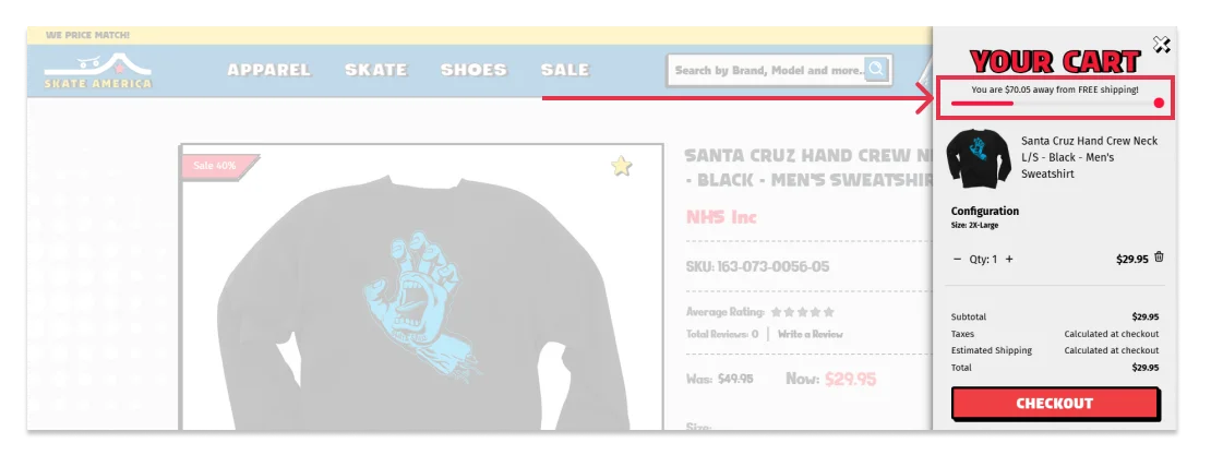 SkateAmerica Shipping Progress Bar Example
Be transparent about shipping and return policies. Don’t hide them behind multiple clicks. And whatever you do, avoid surprise fees. Unexpected charges at checkout — like inflated shipping or extra handling costs — are one of the top reasons shoppers abandon their cart.
Make checkout fast, secure, and crystal clear. No surprises will lead to more completed orders.
Trust Signals Everywhere
Even if your site looks amazing, customers won’t spend money if they don’t feel safe. That’s where trust signals come in.
Start with the basics: show customer reviews prominently on product pages. Highlight any press mentions or awards. Make sure your site uses SSL (look for the padlock in the URL bar) and include recognizable secure checkout icons.
 SkateAmerica Checkout Trust Signals Example
Other trust signals include free shipping banners, satisfaction guarantees, and clear return policies. But human credibility matters too. Include an About page, a real phone number or email, and photos of your team or workspace. These personal touches help build trust — especially for smaller or newer brands.
If your site feels sketchy or anonymous, people will leave. If it feels trustworthy and transparent, they’ll buy.
Built for Growth: SEO + Marketing-Ready Foundation
A good-looking eCommerce website doesn’t mean much if no one can find it.
That’s why SEO matters from day one. Your site should have clean URLs, optimized meta descriptions, alt text on all images, and fast load times. Bonus points if you regularly publish blog content or resource guides — that’s a huge boost for organic search visibility.
Beyond search, your site should support long-term marketing. Make it easy to capture emails with popups or embedded forms. Integrate loyalty programs and customer account tools. And make sure your backend can support essentials like retargeting, segmentation, and automation.
Bottom line: a great site doesn’t just look good — it’s ready to grow with your business.
Conclusion: Looks Matter, But Function Wins
At the end of the day, a high-performing eCommerce site is more than just a polished homepage. It’s a strategic, conversion-focused experience from start to finish.
Yes, visual design matters. But it’s the structure behind the design — fast speed, smooth navigation, trust signals, and smart marketing tools — that actually drives results. Great design builds trust. Smart UX makes buying easy. And when you combine both? That’s when your site starts to sell for you.
Not sure where your website stands? Take a step back and evaluate your homepage, product pages, and checkout flow. Focus on clarity, trust, and performance.
And if you need expert help, reach out to the team at MAKDigital. We’ve helped brands across every industry design and build eCommerce websites that don’t just look great — they grow businesses.