 1-888-553-8776
Responsive Design Case Studies
Byourbed

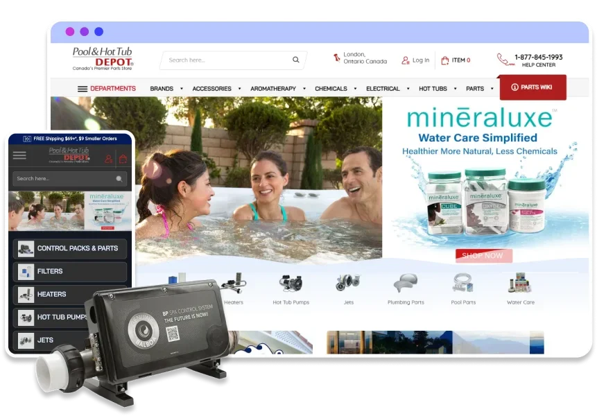
Long Island Watch

Phastek Performance


Responsive Design ensures a consistent and optimized user experience across various devices, including desktops, tablets, and smartphones. By adapting to different screen sizes and resolutions, responsive design eliminates the need for multiple versions of a website, streamlining maintenance and reducing costs. It also enhances SEO efforts, as search engines favor mobile-friendly websites. Furthermore, responsive design improves site accessibility and usability, leading to increased engagement and higher conversion rates. Overall, it provides a seamless and efficient solution for meeting the diverse needs of modern internet users.


Responsive web design is crucial for ensuring that your website provides an optimal viewing experience across all devices, from desktops to smartphones. Below, we answer some common questions about the benefits and implementation of responsive web design to help you understand its importance and how it can enhance your online presence.
Responsive web design is a design approach that ensures websites adapt to various screen sizes and resolutions. This means that whether a user is viewing a site on a desktop, tablet, or mobile device, the website will adjust its layout and content to provide an optimal viewing experience.
Responsive web design is crucial because it enhances the user experience by providing easy navigation and readability across all devices. With the increasing use of mobile devices to access the internet, having a responsive website ensures that you reach and engage a broader audience.
Responsive web design improves SEO by maintaining a single URL and HTML content for all devices, which simplifies crawling and indexing by search engines. Google and other search engines recommend responsive design as it provides a better user experience and reduces the chances of duplicate content issues.
The key components of responsive web design include flexible grids, flexible images, and media queries. These elements work together to ensure that the website's layout and content adjust seamlessly to different screen sizes and resolutions.
Yes, responsive web design can improve website performance by ensuring faster loading times and a consistent user experience across all devices. This can lead to increased user engagement, lower bounce rates, and higher conversion rates.
Responsive web design simplifies website maintenance by eliminating the need to manage separate sites for different devices. With a single codebase and unified content, updates and optimizations can be made more efficiently, reducing the time and cost associated with maintaining multiple versions of a site.
Responsive web design is considered future-proof because it adapts to new devices and screen sizes as they emerge. By using flexible layouts and media queries, a responsive website can accommodate the latest technological advancements, ensuring a consistent user experience over time.
MAKDigital specializes in creating responsive web designs that provide an optimal user experience across all devices. Our team of expert developers uses the latest techniques and technologies to ensure your website is not only visually appealing but also functional and user-friendly on any device.
All industries can benefit from responsive web design. Whether you are in retail, healthcare, education, or any other sector, having a responsive website ensures that your content is accessible and engaging to users on any device.
To get started with a responsive web design project with MAKDigital, simply contact us through our website or give us a call. Our team will discuss your needs, provide a detailed proposal, and work with you to create a responsive website that meets your business goals.
