Concept
ZUUM had been charting a successful course in the industry, operating with an eCommerce site that, quite frankly, had seen better days. The original ZUUM website was akin to a blank canvas, with vast expanses of white space and a glaring lack of branding or style. While its simplicity made navigation somewhat straightforward, it presented a challenge when it came to product information. Vital details were scattered and often hard to decipher, creating hurdles for effective shopping. The absence of contemporary eCommerce essentials like 'Quick View' or 'Compare' only compounded these difficulties.
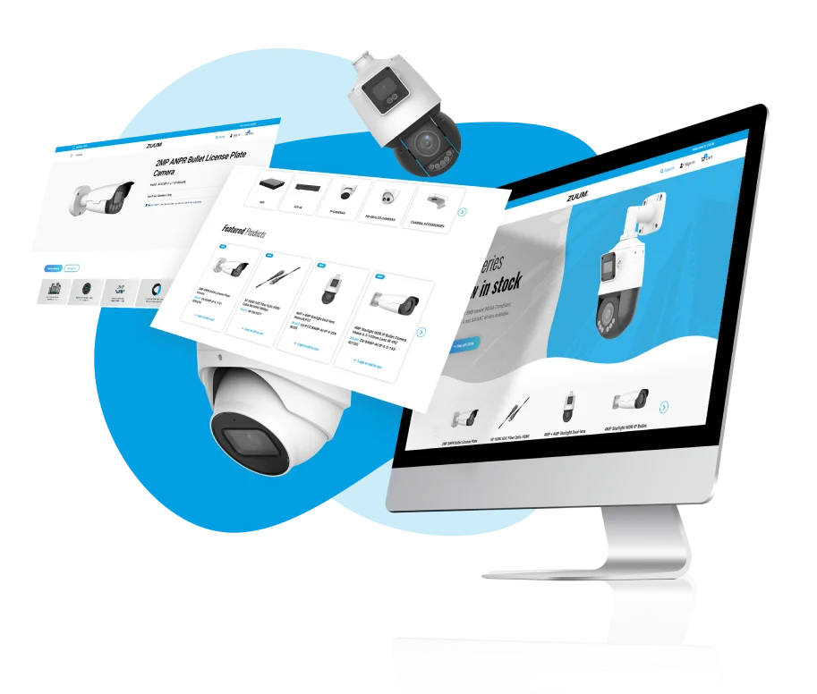
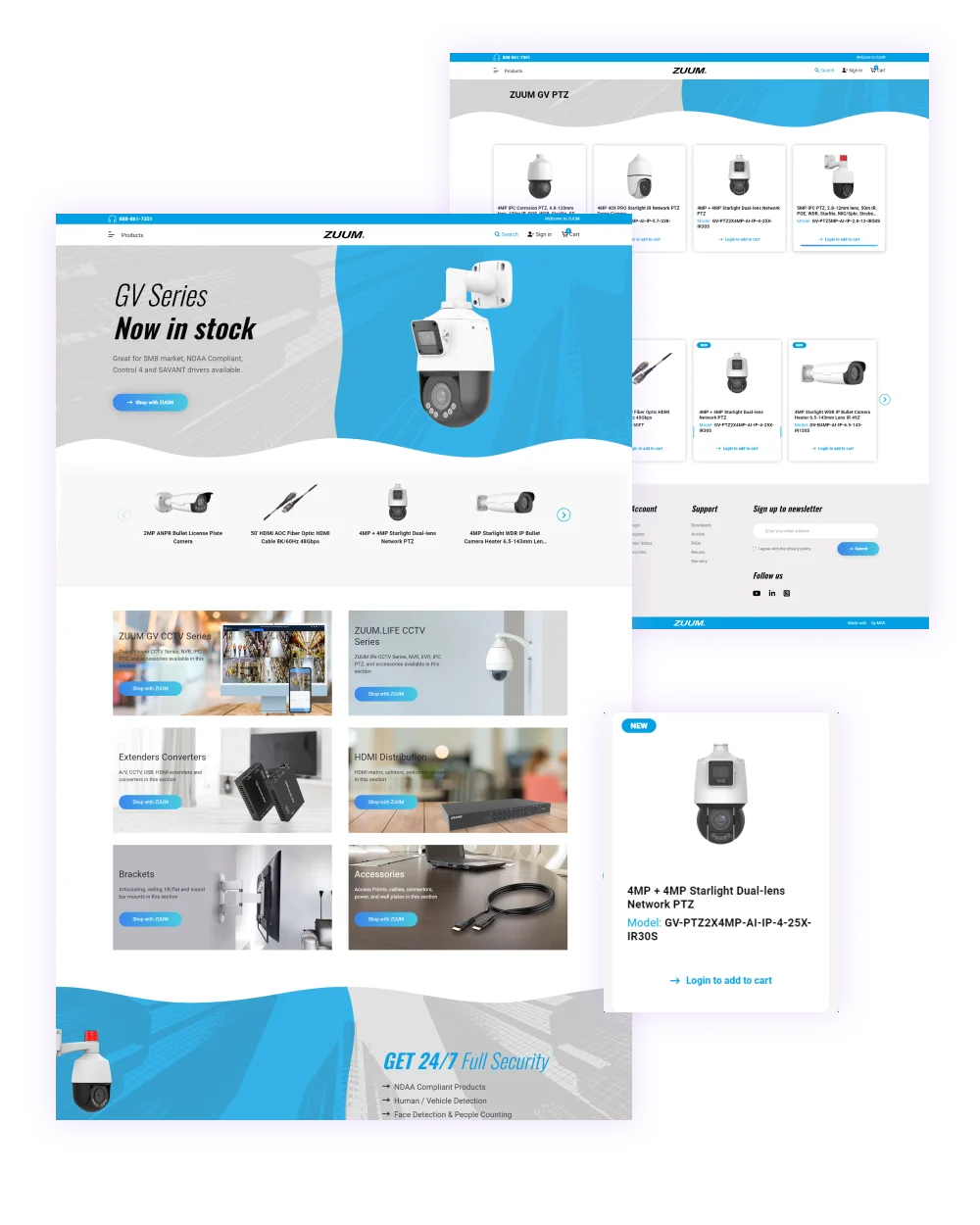
The old website, in terms of design, resembled a novice's first endeavor. It lacked the visual allure to captivate visitors and keep them engaged. But with the advent of the new website, a transformation was underway. It was conceived to be not just aesthetically pleasing but also meticulously organized and search engine-friendly. A modern, up-to-date look and feel were at the forefront, promising an engaging and seamless user experience. The migration from Volusion to BigCommerce, utilizing BigCommerce data migration, became the cornerstone of this evolution. With the new website, visitors could now effortlessly access the information they sought, resulting in a vastly improved and positive user experience.
MAK Digital undertook a comprehensive BigCommerce site design, integrating advanced features to ensure the site was both user-friendly and visually appealing. As a BigCommerce expert, we leveraged our expertise to incorporate essential eCommerce features and optimize the site for better performance. Additionally, BigCommerce search engine optimization was a critical focus, ensuring that the new website was not only functional and attractive but also highly visible in search engine results. This holistic approach guaranteed that ZUUM's new online presence was robust, effective, and ready to meet the demands of modern eCommerce.