Eashan Mehta
In 2025, B2B customers expect more than just information, they expect an experience. The line between B2B and B2C digital expectations has all but disappeared. Today’s business buyers want the same fast, intuitive, and trustworthy online journeys they get when ordering a pair of shoes or booking a flight.
That said, designing for B2B comes with key differences that can’t be ignored. Unlike B2C, B2B websites often deal with longer sales cycles, more stakeholders, and highly specific product or service details. Your visitors might not make a purchase right away, they might be comparing quotes, checking specs, or looking for custom solutions. A strong B2B Website Design anticipates those needs and addresses them clearly.
This shift means that a solid B2B website isn’t just about showing off your products or services, it’s a direct extension of your sales process. A well-designed site builds credibility, simplifies decision-making, and helps you stand out in a crowded, often outdated market. Whether you’re selling industrial parts, SaaS, or wholesale inventory, how your website looks and functions can directly impact how many leads you generate and how many you lose.
In this blog, we’ll break down what makes a B2B website effective in 2025 and what small to mid-sized businesses should focus on to turn their site into a serious growth tool.
First Impressions = Business Credibility
In B2B, an outdated or clunky website can hurt your conversion rate before you ever get a chance to speak to a potential client. It sends the wrong message that your business is behind the times, disorganized, or not serious.
A clean, modern B2B Website design communicates professionalism right away. It shows that you care about the details. Visual consistency, easy-to-read typography, and an interface that actually works, these aren’t just aesthetic choices. They build trust. And in B2B, trust is the first hurdle in winning a lead.
 Example of Budgetheating.com well-organized Mega-nav
To make a strong first impression, your site should include elements that signal structure and usability from the start. A well-organized mega navigation helps users find what they’re looking for quickly. A clear, visible menu structure ensures that key categories aren’t buried. Integrating tools like Searchanise or other enhanced search features can drastically improve the experience for users who land on your site looking for specific products or information. These touches might seem small, but they set the tone for the rest of the buyer journey.
Simplifying Complex Information
B2B buyers aren’t browsing casually, they’re usually on a mission to solve a specific problem or find a precise product. And often, the products or services you’re offering aren’t simple. That’s why clarity isn’t just important, it’s everything.
Good B2B website design helps simplify complexity. You can’t just throw dense paragraphs of specs or product data at users and expect them to stay engaged. Instead, use visual hierarchy and break content into digestible, scannable pieces. Think short headers, concise bullet points, and clear callouts that guide the eye and reduce mental fatigue.
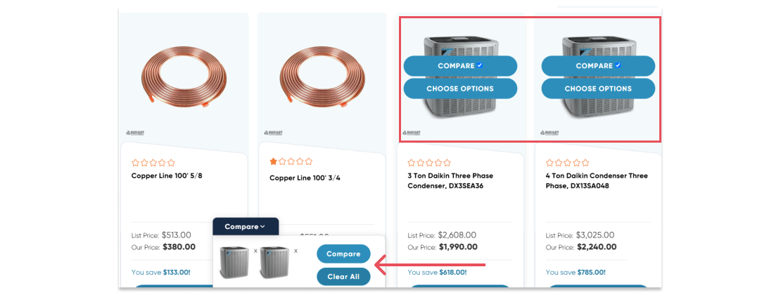 BudgetHeating.com comparison tool
To support this, your site should include tools that make decision-making easier. Comparison features help buyers quickly evaluate multiple products. Sticky navigation bars allow users to scroll long pages without losing context. Expandable accordion sections and tabbed layouts, where product descriptions, tech specs, and shipping details are cleanly separated, keep pages clean and scannable. Smart filtering systems also help users zero in on the exact product they need. You can even add guided flows, such as product finders or quote request wizards, to walk users through complicated decisions step by step.
These design choices do more than clean up your layout, they actively support the decision-making process. And for B2B buyers, that’s exactly what they need: a site that makes their job easier, not harder.
Social Proof and Trust Signals
B2B purchases come with higher stakes, bigger budgets, longer commitments, and more internal decision-makers. That means trust isn’t a nice-to-have; it’s the foundation of the deal. The more credibility your website communicates, the easier it becomes for buyers to move forward confidently.
Social proof is one of the fastest ways to establish that trust. Displaying verified customer reviews, testimonials, certifications, and recognizable client logos can help ease the concerns of first-time visitors. Badges like “Serving You Since 1992” or highlighting your years in business can go a long way in positioning your company as established and reliable.
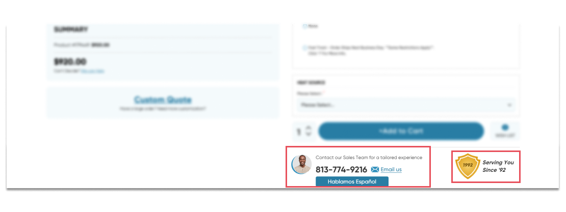 Example of our redesign for BudgetHeating.com, showcasing trust-building elements in action.
For example, on Budgetheating.com’s redesigned site, we highlighted top-selling items and integrated Shopper Approved reviews to showcase thousands of positive testimonials. That transparency immediately built credibility and trust, and it’s something we urge every B2B eCommerce business to incorporate into their design
Conversion-Driven B2B Website Design
Getting someone to your site is only half the battle. The real value of a eCommerce B2B website design comes from its ability to move visitors from passive browsing to meaningful action, whether that’s requesting a quote, booking a demo, or reaching out for more information.
Start by rethinking your calls to action. A button that simply says “Submit” isn’t going to cut it. Your CTAs should be clear, specific, and tied to real outcomes. Say “Request a Custom Quote” or “Get Your Free Consultation”, language that tells the user exactly what they’re getting and what happens next. The more obvious and relevant the CTA, the easier it is for someone to follow through.
Form design is another deal-breaker. Long, complicated forms kill conversion rates. You should only ask for the essentials upfront, name, email, maybe company name. Additional details can come later. If you have to ask more, break it into steps to reduce friction and make it feel more manageable. The less overwhelming it looks, the more likely people are to complete it.
Finally, think about layout and user flow. The information should naturally lead the user toward action. Highlight benefits, reinforce trust with reviews or badges, and keep primary actions above the fold when possible. This isn’t about being flashy, it’s about being clear and intentional. Every decision you make in your layout should support that next step.
Mobile UX Is Not Optional
B2B buyers aren’t just working at desks. They’re browsing on tablets during site visits, checking product specs on their phones during commutes, and comparing options after hours. If your mobile site isn’t fast, intuitive, and easy to use, you’re losing out on serious business.
A strong mobile experience starts with speed and simplicity. Your pages should load quickly, even on spotty connections. Navigation should be streamlined, with menus that are thumb-friendly and easy to tap. Avoid cramming everything into one screen, use clean layouts, collapsible sections, and visual cues to make scanning easy.
Your buttons should be touch-friendly, your forms should be short, and your key actions like “Request a Quote” or “Talk to Sales”, should be front and center, not buried at the bottom of a scroll. Mobile is no longer a secondary channel. It’s the default entry point for many B2B buyers. Treat it like one.
Conclusion
Strong B2B website design isn’t just about branding, it’s a growth driver. From the first click to the final conversion, your site plays a central role in building credibility, educating your audience, and moving them closer to a purchase decision. In today’s market, where buyers expect B2C-level experiences in B2B environments, your website needs to function as a sales tool, not just a digital brochure.
Now’s the time to take a hard look at your current site. Is it easy to navigate? Does it communicate trust? Can buyers find what they need without getting frustrated or confused? These aren’t just UX questions, they’re business questions.
If your site feels outdated or isn’t converting the way it should, we’re here to help. At MAKDigital, we specialize in designing modern, high-performing B2B websites that deliver results. contact us today and let’s talk about how we can align your site with 2025 standards, and your business goals.