 1-888-553-8776
 Marina Lippincott
So, you’re looking for a fast website, right? Well, let me tell you, it’s a common theme in the world of digital
agencies. They often boast about their speed and SEO optimization services with flashy case studies, but when you check the performance of the sites they showcase, it’s often a complete joke!
And here’s another scenario that keeps cropping up: you get on a call with a customer, and they tell you that another agency informed them that because they’re using a theme technology and not a headless build, it’s impossible to optimize for performance.
But here’s my personal favorite: “I was told that Shopify themes are much faster than BigCommerce.”
The truth is, that you can optimize performance on any platform. While headless React builds might make it easier to achieve top-notch performance from the ground up, it doesn’t mean it’s impossible to work with stencil, liquid, or any other templating technology.
One more crucial point that I absolutely must emphasize is that optimization depends on each build, integrations, and the understanding that you get what you pay for. So, fast websites are within reach, but it’s important to set the right expectations and invest in the right strategies.
Poolandhottubdepot.com is a prime example of one of the BigCommerce stores we’ve meticulously built and optimized. You can check out their performance scores right here: https://pagespeed.web.dev/analysis/https-www-poolandhottubdepot-com/nkasm8i59m?form_factor=desktop
This particular store is powered by BigCommerce and utilizes stencil technology. It boasts a rather complex and unique design that’s far from being a cookie-cutter template. We take pride in our work, ensuring that even intricate designs can be optimized for top-notch performance.
Upon completing the initial development, our customer was delighted to see a substantial increase in sales and improved SEO. However, it’s worth noting that the initial build was rather straightforward and lacked specific SEO and performance optimizations.
In March of this year, the customer returned to us with concerns about declining search engine rankings and slower page load times. This prompted us to take a comprehensive approach to address all four scoring factors.
Full BigCommerce SEO Optomization Case Study can be found here.
Performance:
Optimizing website performance is a complex task that involves several key elements, and addressing these aspects can significantly improve your overall performance score. Here are the steps you can take to enhance the performance of your website:
- Update and Streamline Components: Begin by ensuring that all the components used in your website are up to date. This includes the libraries and frameworks in your theme. Eliminate unnecessary components that your website does not require. For instance, if your theme includes features like a quick view option that your store doesn’t use, remove the associated JavaScript and CSS files to reduce bloat.
- Review 3rd Party Integrations: Analyze all third-party integrations used on your website. Multiple third-party services can lead to performance issues, especially if they load their versions of JavaScript. Investigate how each integration functions and find the most efficient way to incorporate them. Avoid situations where multiple services load their scripts directly into a script manager, which can lead to unnecessary bloat. Instead, implement lazy loading for these integrations based on factors like content, device type, and page type.
To implement script loading this implementation can be used: Click Here
What issues will be solved with these techniques?
- Reduce the impact of third-party code
- Reduce unused JavaScript
- Minify JavaScript
- Reduce unused CSS
- Eliminate render-blocking resources
- Avoid document.write()
- Serve static assets with an efficient cache policy
- Minimize main-thread work
- Reduce JavaScript execution time
- Avoid enormous network payloads
- Avoid chaining critical requests
Optimizing the Media Load
When it comes to optimizing media load, specifically images, and videos, there are two primary strategies you can consider:
Utilize a Third-Party Optimization Service: This approach involves subscribing to a third-party optimization service. This service not only provides Content Delivery Network (CDN) capabilities but also optimizes your media for optimal performance on specific devices.
It accomplishes this by serving appropriately sized images in the best format for each device. To implement this strategy, you will need to integrate the third-party service’s API into your website, encapsulated within a media generation component. This approach may require recoding various parts of your site that utilize images.
Some 3rd party media optimization services you can use:
Manual Image Optimization and Custom Media Component: Alternatively, you can choose to manage image optimization manually and create a custom media component for your website. This approach involves optimizing images individually and ensuring they are in the correct size and ratio for efficient loading. Developers will need to manually re-touch every section of your website that includes images to ensure they are optimized properly.
Both of these strategies have their merits and drawbacks:
A third-party service can provide excellent results in terms of media optimization and performance. However, it may require more initial setup work and ongoing maintenance, as well as potential costs associated with the service.
Manual optimization gives you more control over the optimization process and can be cost-effective in terms of not requiring a subscription service. However, it can be time-consuming, especially if you have a large number of images to optimize, and it may require more developer resources for implementation and ongoing management.
The choice between these strategies will depend on your specific needs, resources, and budget. Whichever option you choose, the goal is to ensure that your media assets, such as images and videos, are optimized for both branding and performance, contributing to a faster and more user-friendly website.
What issues will be solved with these techniques?
- Serve images in next-gen formats (only if you use 3rd party media optimizer)
- Avoid enormous network payloads
- Properly size images
- Efficiently encode images
- Image elements do not have explicit width and height
- Avoid large layout shifts
You should consider adding a lazy loading parameter when coding your media serving components, it acts as a crucial aspect of optimizing website performance, especially when it comes to images and other media assets. Lazy loading involves loading an image or media element only when it’s about to come into the user’s viewport, rather than loading all media assets immediately when the page loads. This can significantly improve page load times and overall user experience.
Here are some key points to keep in mind regarding lazy loading:

Fantastic Graphic from our Partner Cloudinary depicting how Lazy Loading works!
- Determine the Threshold: You mentioned that some images need to be lazy-loaded while others do not, depending on their position relative to the top of the page. You can set a threshold or distance from the viewport’s top to determine when an image should start loading. This ensures that images further down the page are only loaded as the user scrolls closer to them.
- Responsive Lazy Loading: Consider making the lazy loading parameter responsive to different devices and screen sizes. Smaller screens may have different viewport characteristics, so adjust the threshold accordingly for optimal performance.
- Implement with HTML and JavaScript: Lazy loading can be implemented using HTML attributes like loading=”lazy” on
tags. Additionally, JavaScript libraries and frameworks often provide lazy loading plugins or options that can be integrated into your media serving components.
- Testing and Optimization: Test your lazy loading implementation thoroughly to ensure it works as expected on various devices and browsers. Monitor your website’s performance to identify any further opportunities for optimization.
Font Optimizations
Managing fonts effectively is an important aspect of website optimization. Here are some best practices for handling fonts:
- Avoid Using CDNs for Font Hosting: While Content Delivery Networks (CDNs) are useful for many purposes, they can introduce additional HTTPS requests and potentially load unnecessary files when it comes to fonts. Instead of relying on external font CDNs, consider downloading and serving the required font files as part of your website’s theme bundle.
- Select Only Necessary Font Files: Be selective in choosing the font files you include in your theme. Include only the fonts that your website uses to reduce the load on your server and improve performance. For example, if your website caters exclusively to the US market and doesn’t require fonts in multiple languages, avoid hosting font files for languages you don’t need.
- Provide a Fallback Font: To ensure that your text remains readable during font loading, always provide a fallback font in your CSS. This is important because fonts may not load instantly, and you want your content to be visible and legible to users as soon as possible. Use generic font families like “sans-serif” or “serif” as a backup until the custom fonts load.
Leveraging React Components
Leveraging React components within your BigCommerce stencil theme can be a powerful strategy for optimizing your website’s DOM size and overall performance. Here are some key components I recommend creating with React to enhance speed and user experience:
- Navigation: Implementing a custom navigation menu with React allows you to create a fast and responsive navigation system that can adapt to both desktop and mobile screens. This can help reduce the DOM size by providing an efficient and streamlined navigation structure.
- Side Cart: A React-based side cart can improve the user experience by allowing customers to easily view and manage their cart items without leaving the current page. This can reduce the need for additional page loads and keep the DOM size in check.
- Category Blocks: If your website has category-specific content or displays, creating React components for category blocks can optimize their rendering. You can use React to conditionally load and display category-specific content based on the user’s device or preferences.
- Infinite Product Load: Implementing infinite scrolling or pagination for product listings using React can enhance the user experience and reduce the initial DOM size. Instead of loading all products at once, you can load them incrementally as the user scrolls, improving page load times.
By creating React components for these key elements, you can address various performance-related issues, including:
- Deferring offscreen images
- Properly sizing images.
- Eliminate render-blocking resources
Cumulative Layout Shift (CLS)
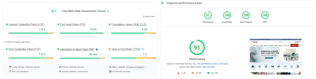
Google Page Speed Insights from Pool&HotTubDepot.com!
Managing the Cumulative Layout Shift (CLS) is indeed crucial for SEO performance and overall user experience. Here are some techniques to minimize CLS and ensure a smoother website interaction:
- Code Mobile-First with CSS: Rather than using max-width, start with a mobile-first approach using min-width and default values for mobile devices. This ensures that your layout is initially optimized for smaller screens and progressively enhanced for larger ones, reducing the chances of unexpected shifts.
- Animation Strategy: When implementing animations, especially on the homepage or hero sections, consider the following strategies:
- Load the first image or content as soon as possible to provide immediate visual feedback.
- Lazy-load subsequent images to prevent them from causing unexpected layout shifts.
- Implement a loading routine for animations, ensuring that they start smoothly after the entire DOM has loaded. Avoid abrupt changes in appearance due to JavaScript initialization.
- Pay attention to how animated components look before and after JavaScript is activated, maintaining a consistent appearance.
- Use different CSS strategies for mobile and desktop if necessary, especially when dealing with text or buttons overlaying images. Customize your approach based on the specific branding and content requirements of each device type.
Handling Overlays:
Overlays, such as cookie privacy notices, can indeed create CLS issues and block crawling. To manage overlays
effectively:
- Consider adjusting scripts to initiate overlays only for actual users and not for crawlers to prevent unnecessary CLS.
- Implement strategies to load overlays in a non-intrusive manner, ensuring they do not disrupt the user experience or content readability.
- Evaluate the impact of overlays on search engine results pages (SERPs) and take measures to minimize any negative effects.
Accessibility & SEO:
Accessibility and SEO. They’re like peanut butter and jelly – they just go together!
Forget about third-party accessibility apps; they’re usually not great and can slow down your site. Vision-impaired users often dislike them too. Only consider them if you’re dealing with potential lawsuits. If you do, customize them properly instead of using a quick copy-paste method.
Instead, make sure all your page elements are coded and tagged correctly. This helps both with accessibility and SEO. Tailor it to your client’s specific needs. Do not overlook color contrasts; screens vary. But, work with your client to find a solution that matches their branding and keeps everyone happy.
SEO:
Ensure that all your website elements are easy for search engines to crawl, and use HTML correctly.
Don’t overlook the importance of adding alt and title tags to your images. Always have a fallback strategy in place.
Best Practices:
To put it simply, most best practices will naturally fall into place if you follow the steps mentioned earlier.
In conclusion, it’s important to understand that these scores aren’t set in stone; they can change over time. To consistently perform well, ongoing maintenance and adjustments are essential. Additionally, many of these elements are integral to your SEO strategy, your choice of technology stack, and your content-specific approach. Staying adaptable and proactive is key to long-term success.


