 We help you sell more | Request a Free Quote
 1-888-553-8776
 Aisha
Aisha
Responsive Design Is Important In eCommerce
Whether you’re a marketer or just someone who’s attached to their phone, you’ve probably noticed that there’s been a significant increase in mobile device users everywhere. In fact, by 2018 it’s expected that the “number of mobile-connected devices will exceed the world’s population by 2014.” Because of this climb in mobile users, there’s been a lot of buzz surrounding responsive design.
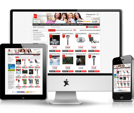
For those unfamiliar with responsive design, it refers to a website that’s been designed to adjust to various screen sizes and resolutions. This means that a website owner only needs to have one site built for both their desktop and mobile users. That saves owners a lot of time and money because they don’t have to build separate sites for desktop and mobile devices. And, since there’s just a single URL, a responsive web design can help improve your SEO campaigns. I also shouldn’t forget to mention that Google recommends it as well. You need responsive design for your eCommerce business. Here’s why.
Responsive web design results in more people buying your product. So, how does a responsive web design make more people buy your product? According to a study conducted by the Aberdeen Group, websites featuring a responsive design were rewarded with a 10.9 percent increase in visitor to buyer conversion rates year-over-year. As for non-responsive websites, there was just a 2.7 percent increase.
Popular e-commerce store O’Neill Clothing provides an example of how responsive design can improve conversion rates. According to research, after their firm switched over to a responsive web design, O’Neill found the following results after a three week period:
For iPhone/iPod:
Conversions increased by 65.71%
Transactions improved by 112.50%
Revenue increased impressively by 101.25%
For Android devices:
Conversions increased by 407.32%
Transactions jumped up by 333.33%
Revenue increased skyrocketed to 591.42%
Why did the move to a responsive website design have such an impact on O’Neil and many others? Because it enhances the user experience.
Enhances User Experience

As you’re probably aware, your website is used to share content. So, wouldn’t you want to make it easier for your visitors to find and pass along your material? Responsive web design helps to do this. A responsive web design also delivers a constant experience for users who are browsing across multiple devices. Instead of having them zoom excessively or pinch their screens to see what your site offers, you’re giving them an easier-to-absorb website that feels more like they are using their desktop.
When users have the same content on their mobile devices as they do on their desktop, then bounce rates decrease. With a responsive design, users have access to a functional and accessible website on which they can find the exact information that they’re searching for. When visitors have this information, you don’t have to be concerned with them leaving for a competitor’s site that already takes advantage of mobile design.
You’re Reaching Your Audience

A lot of people have a mobile device. For example, in the United States alone 58 percent of the population owns a smartphone. More importantly, it’s how smartphone users are spending their time on their phones that can affect your conversion rate.
According to Campaign Monitor, 42 percent of all emails are opened on mobile devices. The Pew Research Internet Project discovered “67 percent of cell owners find themselves checking their phone for messages, alerts, or calls–even when they don’t notice their phone ringing or vibrating.” No matter the study you examine, one thing is clear. To target your audience correctly, you increasingly need to have a website that is mobile friendly.
“Let’s say you send an email out to your subscribers and they can’t read it. What do you expect will happen? It’s going to get deleted,” says Pek Pongpaet, CEO of Silicon Valley design firm Impekable. “KISSmetrics actually discovered that 90 percent of people will do this. Speaking of email, it’s also been found that click-rates decrease on mobile devices when compared to laptops or webmail.”
Besides emails being mobile friendly, your landing page also has to be as well. As noted earlier, you have to give visitors a great user experience. Since customers are regularly going back and forth on devices it’s expected that the landing page be the same on desktop and mobile. Remember, if your visitors can’t navigate your landing page and easily fill-out an opt-in you can expect a lower conversion rate.
If you haven’t jumped on-board with this growing responsive design trend, then it’s definitely time to make the switch. It’s a necessity for each and every e-commerce site simply because it has major effects on whether people buy products.