Eashan Mehta

An eCommerce web design isn’t just about making your online store look good it’s about helping people take action. Whether that’s clicking “Add to Cart,” signing up for your email list, or completing a purchase, every part of your website should be working toward one goal: conversion.
But too many small businesses treat their eCommerce web design as decoration instead of strategy. The result? Confusing layouts, cluttered product pages, and missed sales. Good eCommerce web design builds trust, makes navigation easy, and gives shoppers the confidence to buy.
The good news? You don’t need a total website overhaul to see results. In this blog, we’ll walk you through 10 proven eCommerce web design features that boost conversions features you can start implementing right away. From smart navigation to faster checkouts, these tips are built for small teams, real budgets, and stores that are ready to grow.
Clear and Sticky Navigation
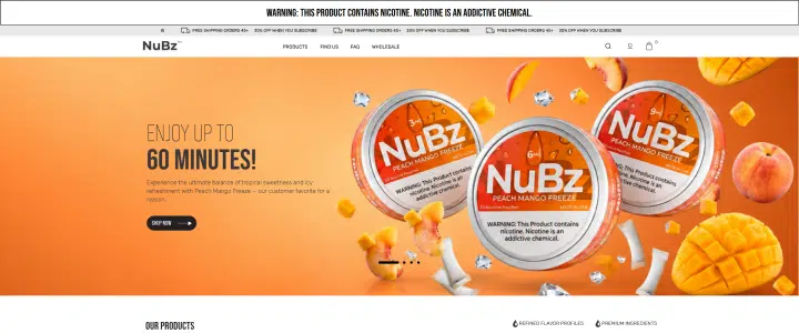
 Example of Pool and Hot Tub Depot Sticky Navigation
When visitors land on your site, they should instantly understand how to get around. That’s where clean, intuitive navigation comes in. A well-organized menu helps shoppers find what they’re looking for without frustration and keeps them on your site longer.
Sticky headers are another smart addition. These keep your main menu visible even as users scroll, so they can jump to another category or return to the homepage anytime without hunting for links. It’s a small change that makes a big difference in usability.
Keep your navigation simple. Focus on a few key categories, use clear wording, and make sure it works just as smoothly on mobile as it does on desktop. A great navigation setup isn’t flashy it’s functional. And that functionality builds trust and helps increase conversions.
High-Quality Product Images and Zoom
When shopping online, customers can’t touch or try the product so images do all the talking. High-quality product photos are essential for building trust and reducing hesitation. Clear, professional visuals help shoppers feel confident about what they’re buying.
Zoom functionality is a must. Let users inspect texture, color, and detail without having to guess. If you can, go further with 360-degree views or product videos. These tools make your store feel more interactive and your products feel more real.
You don’t need a full studio setup to start even improving lighting and showing multiple angles can make a big impact. When people see your product clearly, they’re more likely to buy it.
Fast Page Load Speed
 Dick Pond Athletics Page Load Speed
Speed builds trust. If your site takes too long to load, many shoppers will leave before they even see your products. In fact, page load time is one of the biggest factors affecting bounce rates and conversions.
To stay competitive, your store needs to load fast on all devices especially mobile. Use tools like Google PageSpeed Insights or GTmetrix to test your site’s performance. Compress images, reduce unnecessary scripts, and use a content delivery network (CDN) to improve load times.
At MAKDigital, we help brands optimize their sites for speed without sacrificing design. A faster site doesn’t just feel better it converts better.
Mobile-Optimized Design
Most of your customers are browsing and shopping from their phones, not desktops. That means your site needs to look great and work flawlessly on smaller screens. Mobile optmization is no longer optional it’s critical for conversions.
Responsive layouts automatically adjust to fit different screen sizes, ensuring everything is easy to read and navigate. Buttons should be large enough for thumbs, and menus should be simple to tap through. Avoid overcrowding the screen with too many eCommerce web design elements or pop-ups.
If your site is hard to use on a phone, shoppers won’t wait around. They’ll bounce. A smooth mobile experience keeps them engaged and leads them closer to checkout. Test your store on various devices and prioritize mobile usability it could be the easiest way to increase sales.
Easy-to-Find Reviews and Social Proof
Trust is everything in eCommerce, especially for small businesses. One of the fastest ways to build that trust is by showcasing customer reviews, ratings, and testimonials right where shoppers can see them. When people see real feedback from other buyers, they feel more confident making a purchase.
Place reviews on product pages, below key items, or even on your homepage. Add star ratings, pull quotes, and photos from real customers if possible. Make it feel authentic and honest that’s what builds credibility.
You can also highlight third-party trust indicators like badges from platforms such as Shopper Approved. These add an extra layer of reassurance, showing that your service has been independently verified and rated by real users.
The goal is simple: when a new visitor lands on your site, they should see proof that other people have bought from you, had a good experience, and recommend your products. That kind of social proof turns browsers into buyers.
Clear Call-to-Action (CTA) Buttons
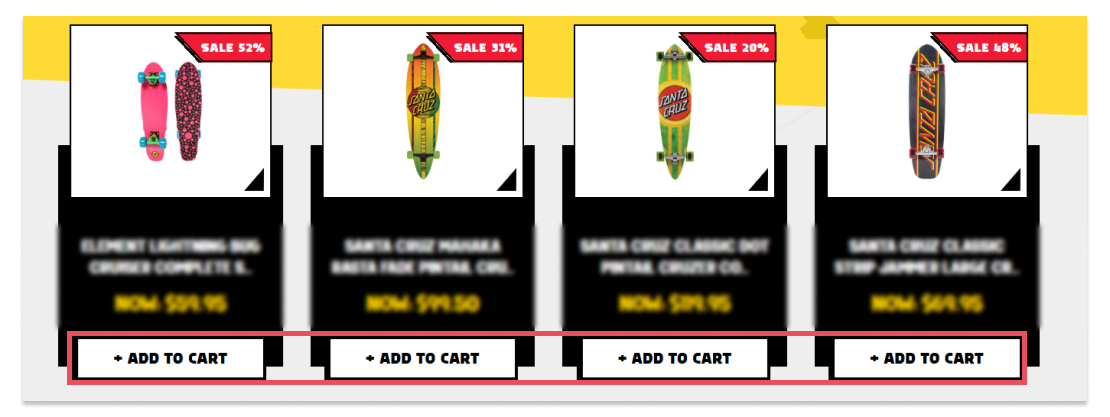 SkateAmerica’s CTA
Your call-to-action buttons are some of the most important elements on your website. They’re what guide your visitors toward making a purchase, signing up, or taking the next step. That’s why they need to be clear, bold, and easy to spot especially on product pages and landing pages.
Effective CTAs are action-oriented and direct. Use phrases that encourage clicks, like “Add to Cart,” “Buy Now,” or “Get Yours Today.” Avoid vague language like “Learn More,” which doesn’t make the next step obvious or urgent.
Placement matters too. Your CTAs should appear above the fold, meaning users shouldn’t have to scroll to see them. Make sure they’re visible on both desktop and mobile, and don’t bury them in clutter. A well-placed, well-worded button can dramatically improve conversion rates by showing users exactly what to do and making it easy to do it.
Simplified Checkout Process
A complicated checkout process is one of the fastest ways to lose a customer. Every extra click or unnecessary form field increases the chance that someone will abandon their cart. That’s why a simplified checkout is essential for boosting conversions.
Start by offering a guest checkout option. Not everyone wants to create an account just to make a purchase. Use autofill wherever possible to speed up the process, especially for shipping and payment information. Clearly display a progress indicator so customers know how many steps are left this helps reduce anxiety and keeps them moving forward.
Also, limit the number of fields on each page. Only ask for the information you truly need to complete the order. A clean, quick, and intuitive checkout flow makes it more likely that shoppers will follow through and come back again.
Trust Signals (Badges, Guarantees, Security)
When a shopper is deciding whether to make a purchase, trust plays a huge role. That’s where trust signals come in. These are small but powerful visual cues that reassure customers their purchase is safe, protected, and risk-free.
Start by displaying security badges from trusted providers like Norton, McAfee, or SSL certifications. These help users feel confident entering their payment information. Add clear information about your return policy and satisfaction guarantees — and make it visible near the add-to-cart button or in the footer. If you offer free shipping, highlight that too. It can often be the nudge someone needs to complete a purchase.
Trust signals remove doubt. They don’t just make your store look more professional they directly improve conversions by reducing hesitation in those final, crucial moments before checkout.
Smart Search and Filtering Tools
 Aventis Sysyem utilizing Searchanise Smart Search Platform
Great design isn’t just about what users see it’s about how easily they can find what they’re looking for. Smart search and filtering tools are essential for helping shoppers move quickly from browsing to buying.
Make sure your on-site search is fast, intuitive, and typo-tolerant. Features like auto-suggest, predictive text, and recent search history can dramatically improve the experience. Tools like Searchanise make this easy to implement offering powerful filtering, instant search results, and customization that fits seamlessly with most eCommerce platforms.
When it comes to filtering, let users narrow down results by size, color, price, brand, or whatever matters most in your category. When people can quickly find the right product without getting frustrated, they’re far more likely to convert. Clean, responsive filtering and a smart search bar are simple upgrades that deliver serious results.
Clear Value Props on the Homepage
When someone lands on your homepage, you have just a few seconds to make an impression. That’s why your value proposition needs to be front and center. Visitors should immediately understand what you sell, who it’s for, and why it’s worth buying from you without needing to scroll or click around.
Use a clear, benefit-driven headline paired with subhead text that explains what sets your store apart. Support this with simple icons and short blurbs that highlight your main selling points like fast shipping, ethical sourcing, or 24/7 customer support. These should all be visible above the fold and easy to scan, especially on mobile.
The goal is clarity, not clutter. When your value proposition is obvious and persuasive, visitors are more likely to stay, explore your products, and eventually convert into customers.
Conclusion
Great eCommerce web design isn’t just about making your site look good it’s about guiding your customers toward taking action. Every design choice, from navigation to CTAs, should make it easier for shoppers to browse, trust, and buy.
The best part? You don’t need to overhaul your entire website to see results. Even small improvements like adding trust badges, improving mobile navigation, or simplifying your checkout can have a big impact on conversions.
If you’re ready to turn more visitors into customers, MAKDigital can help. Our team specializes in conversion-focused design tailored to your unique business. Whether you need a few updates or a strategic redesign, we’ll help you build a storefront that performs as good as it looks.