 1-888-553-8776
 Nick
Nick
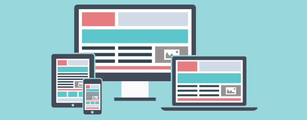
WordPress is powerful — that’s why people love it. It’s free, open-source, and backed by a huge community. Creating a responsive design and integrating a responsive WordPress theme is fairly easy once you know the basics. But when it comes to responsive images, WordPress doesn’t do everything out of the box.
If you want true responsive image support, it’s not enough to just upload a high-resolution image and hope for the best. You’d have to manually resize each image file, then go into the HTML editor to set the image tag, srcset attribute, and sizes attribute. Not ideal — especially for non-technical users.
On top of that, loading all images at once — especially large ones — can hurt performance. That’s where lazy loading comes in. It delays loading images until they’re about to be seen, saving bandwidth and improving page speed, especially on mobile devices.
WordPress does help by generating different image sizes automatically, including a default thumbnail size (150×150 pixels), which is useful for image previews, gallery grids, and archive pages. But for responsive design, you’ll need more flexibility.
Luckily, with a few changes and a plugin or two, you can have WordPress do the heavy lifting. It’ll automatically crop and resize your images, apply image optimization, implement lazy loading, and deliver the best image for the user’s device’s screen size. Here’s how to get started.
STEP 1: Modify functions.php to Generate More Image Sizes
When you upload an image to the WordPress media library, it saves the original image and creates three additional sizes: Thumbnail (150×150), Medium (300×300), and Large (1024×1024). This happens automatically and is controlled by your media settings, which manage the image dimensions.
The good news is, you can customize this and generate as many sizes as you want. WordPress supports the add_image_size function, which lets you define new sizes by image width, max width, or even crop dimensions to maintain the aspect ratio.
For example, you can add four new sizes: 300, 600, 1200, and 2400 pixels wide. Each size corresponds to different screen widths or screen sizes, helping the browser load the appropriate image in different sizes. These sizes will be created each time a new image is uploaded.

STEP 2: Install the RICG Responsive Images Plugin (For Theme Developers)
To enable native responsive images in WordPress, install the RICG Responsive Images plugin. It enhances the default image markup so that every image includes srcset attributes and sizes attribute, letting the browser pick the most suitable image size.
Normally, WordPress outputs a basic image tag with a single source. With the plugin, multiple image sizes are added through the srcset and sizes attributes, allowing browsers to load the correct file based on screen size and resolution.
The plugin also includes Picturefill.js to offer backward compatibility and responsive image behavior in older browsers. Now, based on the screen size, your web pages load the most efficient image — boosting loading speed, image quality, and saving bandwidth.

STEP 3: Install Plugin to Re-Generate Image Sizes (Optional)
If you’re working on an existing site, your past uploads won’t have the new sizes. New images uploaded will benefit from responsive image support, with specific attributes and sizes created to enhance performance and user experience on various devices. That’s where the Regenerate Thumbnails plugin comes in.
This tool scans your wp-content folder, finds every image uploaded, and reprocesses them using your new custom sizes from functions.php. It ensures that all images, from thumbnail size to large formats, are resized appropriately and tagged with the correct responsive attributes.
Once installed, head into the WordPress dashboard, go to Tools → Regen. Thumbnails, and click “Regenerate All Thumbnails.” The plugin will process every image and generate all the defined sizes.
You can also pair this with custom CSS rules using min width or media queries to fine-tune how images appear across different screen sizes. Additionally, using a specialized Content Delivery Network (CDN) can compress images, eliminating the need for additional compression plugins and enhancing image management efficiency.
Final Thoughts
- WordPress automatically crops and resizes your images to ensure they are displayed optimally across different devices
- The browser loads the correct size based on screen sizes
- You reduce load times and improve UX on all responsive websites
- You keep your file size optimized without losing image quality
For theme developers, content creators, and anyone working on WordPress, setting up responsive images, including avoiding the use of full size image on mobile devices, is no longer a hassle — it’s just good practice.


