Google recently created a whirlwind of chaos in the mobile SERPs with their quality update. You can avoid this drama by having a mobile optimized site, and obtaining a nice ‘Mobile-Friendly’ tag from Google in the search results. What helps you meet the new status quo, and what causes failure? That’s what MAKDigitalDesign is here to let you know.
Google uses 5 key usability tests to determine whether a site is mobile-friendly. Some of these tests are more important than others, and some of the tests only have an impact in certain cases. Some used to think font size was all you needed to have right for mobile. But, it turns out that the mobile-friendly rules are simply not black and white. They’re actually more in a fifty shades of grey area…Here’s a rundown of what we know…
April 21st – Google began rolling out their new mobile-friendly algorithm. According to Google, if your webpages are not mobile-friendly, they may not rank as well in mobile search.
Heres how the new “mobile-friendly” algorithm works:
The algorithm works on a page by page basis (URL level, not domain level). Googlebot crawls the page, and using the factors listed below, decides whether you are “mobile-friendly” or not.
It’s a yes/no factor – you’re either mobile-friendly, or you are not. (no shades of grey here; simple as black and white, folks.)
OK, now that you know that, is your site mobile-friendly??
(This method only checks one URL at a time, so you have to do this for every page on your site.)
OH NO! my site isn’t mobile-friendly?
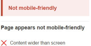
If your site isn’t mobile-friendly, upon testing one of your URLs, you’re going to get this sort of result:
Here are the 5 “rules” to pass Google’s “mobile-friendly” test:
√Uses Incompatible Plugins – don’t use plugins that most mobile browsers don’t support, like Flash or Silverlight √ Content Wider Than Screen – make sure content fits within the viewport, so there is no horizontal scroll √Links Too Close Together – make sure your links/buttons are easy for mobile users to press √Text Too Small To Read – make sure your font is big enough for mobile users to read √ Mobile Viewport Not Set – make sure that your page specifies a viewport, or adapts to different devices
5 simple mobile lessons you can take from these rules:
#1: Incompatible plugins = NO!
A big no-no. If you have incompatible plugins on a webpage, it won’t be classed as mobile-friendly. Worse than that, they straight up won’t want to show such content. If you’re using Flash on your site…you might want to stop! (unless it’s Youtube). The issue with Adobe Flash is that most mobile devices do not support it. The videos do work on mobile (YouTube provide alternative players) to provide better user experience. Being so, you may pass the mobile-friendly test, and pass every other test EXCEPT for ‘incompatible plugins’. (This is something MAKdigitaldesign can help you with.)
#2: Content width
If the page content is too wide for the viewport, the user will be forced to scroll horizontally. I personally feel this is one of the key factors in figuring out whether a site is mobile-friendly or not. Maybe only one of the pages on your site has content that isn’t scaled for mobile viewing. This sort of thing could easily be overlooked, which is why it is crucial that all important search pages are checked individually. In some cases, a page will fail on the test for ‘Content Wider Than Screen’, but will still pass as mobile-friendly. Google may not always mind if the content doesn’t fit perfectly, but in some cases they will penalize you for it. In fact, the Mobile-friendly API will ‘Fail’ your page for this test even if you are only 1 pixel over!
#3: Links too close? Google doesnt care! …except for when they do.
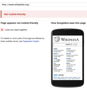
This one comes down to extremes..Wikipedia’s generic homepage fails on account of their huge list of links which are too close together. Fortunately for Wikipedia, they already have a mobile version of the site which Google displays first anyway. Many pages fail the test ‘Links Too Close Together’ yet still get the Mobile-Friendly tag. I’ll keep this lesson short…Don’t make massive lists of links. OK, onto the next one..
#4: Size is everything
This one’s EXTREMELY important…if you mess this up, chances are you can expect a big ugly “NOT MOBILE FRIENDLY” tag stamped on you by Google. Actually, they are not going to stamp you or your site with anything at all. It will in fact be the absence of a tag that stands out.
Putting it simply…
small text = no visibility = horrible user experience + no mobile friendly tag for you! (i think i’ve established how NOT good that is by now, right? RIGHT.)
The text which Google considers ‘too small’ is usually always supplementary text – short tags or lists, never proper sentences or body copy. It’s certainly possible you can get a mobile-friendly tag even if some of your fonts are too small. This again, lands us somewhere within the 50 shades of grey-area mentioned before. Just to play it safe, at the minimum, make sure your main page content is in a legible font size.
#5: Size is everything (wait WHAT?!?)
Yep, I said it again. This is because font size is also dependent on the viewport settings, which control how a webpage is displayed on a mobile device. A page without a properly configured viewport often results in text being way too small to read. (.i.e) You’re browsing on a device, lets say…looking for a great take-out place nearby. You find a link. Click. THEN – Pinch-zoom, read, scroll right, read, pinch, zoom, scroll, read… Annoying, Right? This is because the site or page you’re viewing isn’t optimized for mobile viewing.
*Bonus* #6: Robots.txt can ruin EVERYTHING
Woo-hoo! Bonus round. Google is assigning the ‘Mobile-friendly’ tag to sites which pass their test. At the moment this is based largely on using legible fonts & avoiding Flash plugins. Some CSS or Javascript resources are being blocked by robots.txt, & the page may not look mobile-friendly to Googlebot (even if it actually is to users). This means there is a disconnect between how Googlebot sees the page and how users see it. Because Googlebot can’t crawl some resource files, they may see certain pages as having content wider than the screen, which looks like a terrible user experience. As a result, your site is stamped NOT “Mobile-Friendly” & will or has already face a major rankings drop. So, If you think you’re in the clear and have a mobile friendly site, make sure your robots.txt file is not ruining that for you. You could have a beautiful, responsive site, which is being completely undermined by an unresponsive embed.
Hopefully this post has given you a bit more context for Google’s new “Mobile-Friendly” rules, and most importantly, detailed how they might trip you up, even if you think you’re covered. If you have questions, or have already failed the “Mobile-Friendly” test, contact us here at MAKDigitalDesign.
CiBon Jackson specializes in building search visibility that converts. He pairs analytics with creativity to craft content, refine site architecture, and align pages to user intent. From keyword research to technical fixes and on-page optimization, he delivers measurable gains in traffic and leads.
 1-888-553-8776
 CiBon Jackson


