eCommerce shopping has come a long way from when a handful of enthusiastic people experimented with shopping online to prove to their friends and family that shopping can be digital. Now, the mere possibility of shopping online no longer moves buyers because they want a top-notch online shopping experience. Whether shopping on a desktop or a mobile device, buyers want a smooth purchase journey, which leaves no room for eCommerce stores to take things for granted. Yet, 88% of eCommerce shopping carts get abandoned, which means online stores can do more to maximize profit.
In this article, we will discuss nine proven mobile shopping cart design tips that will reduce your cart abandonment rates and boost sales.
Use a Direct CTA
Sometimes when shopping online, buyers just want to buy a list of items and keep it moving, and they don’t want any distractions. These types of buyers will appreciate a concise call-to-action (CTA) that lets them check out and go. So, while you try to upsell and cross-sell to your buyers, ensure they can buy immediately from their cart without clicking multiple buttons. Add a CTA design that takes buyers from one click to the checkout page, and don’t add multiple CTAs to avoid confusing your buyers.
See how Apple and Shein use a direct CTA to urge buyers to check out immediately.

Share a Detailed Product Summary
While we can assume that buyers know a lot about the items in their shopping carts and won’t be learning any new information with a product description, you should still add a product summary. Include all relevant information about the product in the product summary; size, color, weight, quantity, features, packaging, etc to help customers review, confirm, and update vital details. A lack of a product summary on the shopping cart page can discourage buyers.
Add High-Quality Product Media
Sure, you have high-quality product media on the product page where buyers found the product in the first place, but that’s not enough reason to make the shopping cart page all text and no media. Your shopping cart design should include high-quality media so that buyers are constantly reminded of what the items in their shopping cart look like.
Add a Wish List or Save For Later Feature
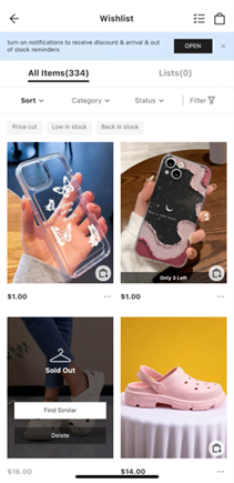
Most buyers have a budget and a list of items they want to buy when they shop, but that doesn’t stop them from wishing they can buy other items too. But they can shop and buy the items later, right? The truth is buyers will forget some items they like if the shopping cart doesn’t have an element that reminds them or makes it easy for them to remember. Hence, this is a good reason to add a wish list or a save-for-later design feature to your mobile shopping cart. That way, buyers can browse your online store to window shop and add items to their carts or add to their wish lists to buy later.
Shein is one of the many online stores that take advantage of the wish list feature, encouraging buyers to come back and shop.
Provide Clear Shopping Information
According to Statista, 41% of online shoppers abandoned eCommerce shopping carts because of unexpected delivery/shipping information — the most common reason for cart abandonment. Design your mobile shopping cart with detailed information about delivery/shipping costs, estimated taxes, and other shipping information. Don’t forget to add multiple shipping/delivery options as well. Buyers shouldn’t have to jump through hoops to find shipping information.
Make The Shipping Cart Accessible
When shopping online, it’s common for buyers to want to see their carts before they are ready to go to the checkout page. Your mobile shopping cart should make it easy for them to do so. Add a design feature that makes the shopping cart visible and accessible as they browse to enable them to review and make informed shopping decisions. Hence, they won’t have to leave their current page and go to the dedicated shopping cart page.
Take a look at the shopping cart visibility feature on Apple.

Allow Guest Checkout
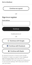
One of the perks buyers enjoy when they walk into an on-site store to make a purchase is no signup requirement, and they can buy whatever and leave. No one is asking them for their name, email address, phone number, nickname, and other personal details buyers have to enter when signing up on an eCommerce platform. You can replicate this experience with your online store by allowing guest checkout — no need for a new buyer to sign up or log in to complete a purchase.
Etsy uses this functionality to increase its conversion rates.
Upsell and Cross-sell
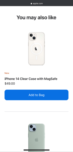
You have a better chance of making a committed buyer on their shopping cart page to buy more items, so seize the opportunity. You can suggest similar but more expensive products than the products in their carts or related products to the ones they picked to increase your average order value. Use behavioral analytics tools and machine learning technology to make accurate and personalized suggestions to each buyer.
eCommerce stores upsell and cross-sell to customers using terms like “customers also bought,” and here is a “you may also like” from Apple on a buyer’s shopping cart.
Implement an Auto-save Cart Functionality
Buyers abandon online shopping carts for countless reasons, some reasons such as slow loading speed, poor internet service, device battery running out, suddenly getting busy, etc. The point is, sometimes, buyers abandon their carts without planning to do so, and it will be frustrating when they come back days later and have to search for the same items again. Hence, your mobile shopping cart design should take care of this concern by adding an auto-save cart feature that saves shopping carts until the buyer is ready to checkout.
Wrapping Up
Finally, ensure your mobile shopping cart gives buyers a full sense of security. They should feel confident entering their shipping and payment information without the fear of falling victim to fraud. As you invest in the functionality of your mobile eCommerce business, so should you invest in the aesthetics of the store.

