This blog post was brought to you by Toptal.com. A Developers website.
Mastering web layout without mastering CSS is about as feasible as learning to swim on dry land. But unlike swimming – which, once mastered, is a skill that remains with you for life – mastering CSS is a process that never really ends since CSS itself is continually evolving.
The challenge is aggravated by differences in CSS implementation and support across different browsers (and even across different versions of the same browser), as well as different rates of adoption of CSS recommendations. For well over a decade, web designers and developers have been grappling with sporadic and inconsistent bursts of additional CSS3 features being supported in each new browser version.
But be that as it may, mastering CSS is an absolute necessity for any solid web designer or developer. This article will walk you through some fundamental CSS layout principles, from classic CSS2 techniques to the latest layout approaches in CSS3.

NOTE: All code samples in this article use HTML5 elements and Sass syntax. Full working code can be cloned from https://github.com/laureanoarcanio/css-layout-examples.
Use Case
One of the best ways to learn a technology is to have a specific use case you’re attempting to support or a particular problem you’re trying to solve. Toward that end, we’ll focus on a use case with a specific set of requirements.
Our use case consists of a Web App layout with some dynamic behavior. It will have fixed elements on the page such as a header, footer, navigation menu and sub-navigation, as well as a scrollable content section. Here are the specific layout requirements:
- Basic Layout
- Header, footer, navigation menu, and sub-navigation all remain fixed on scroll
- Navigation and sub-navigation elements occupy all vertical free space
- Content section uses all remaining free space on the page and has a scrollable area
- Dynamic Behavior
- Navigation menu only shows icons by default, but can be expanded to display text as well (and can then be collapsed to again show only icons)
- Layout Variations
- Some pages have sub-navigation next to the navigation menu and some do not
CSS Tutorial Using Classic CSS2 Techniques
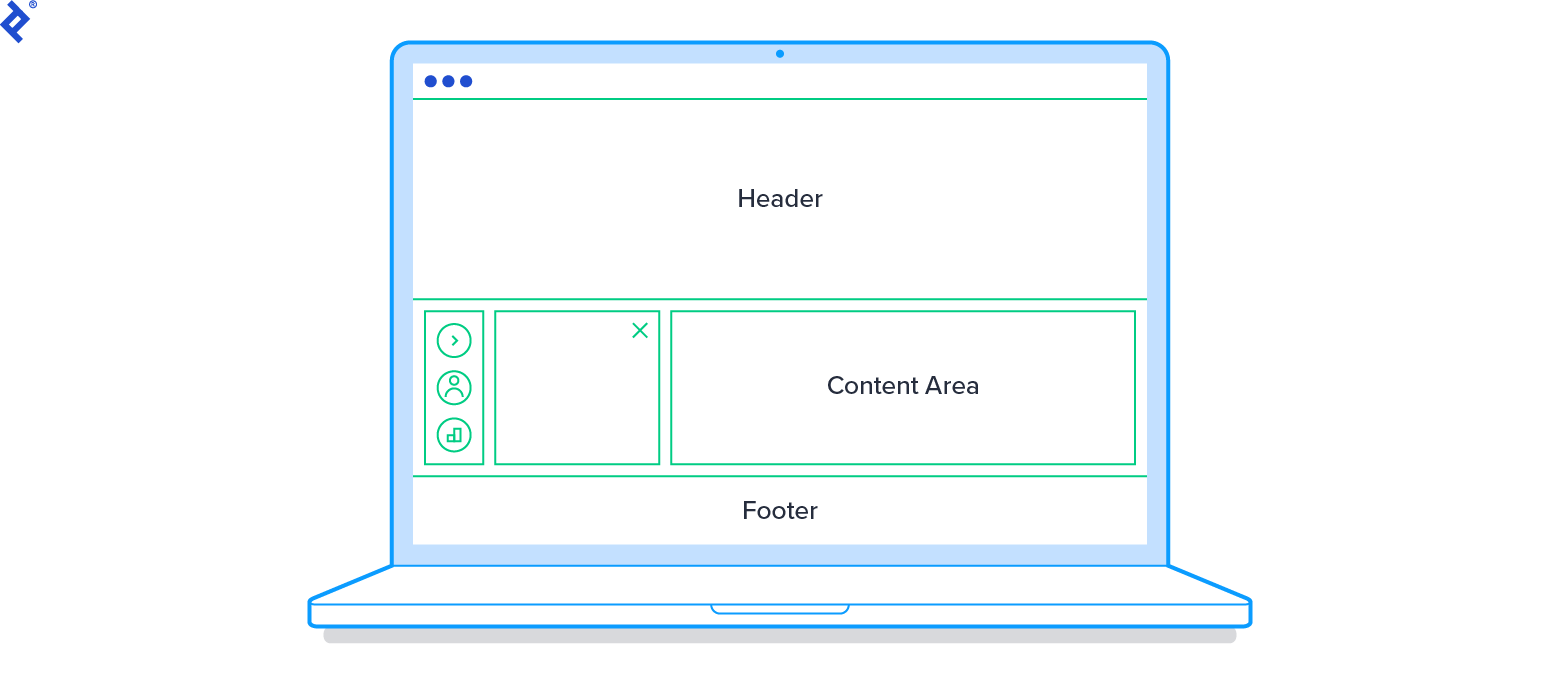
For starters, here’s the HTML5 markup we’ll use with our sample implementation using classic CSS:
<body class="layout-classic">
  <header id="header"></header>
  <nav id="nav"></nav>
  <aside id="subnav"></aside>
  <main id="main"></main>
  <footer id="footer"></footer>
</body>
Fixed Positioning
In CSS2, we can achieve the fixed elements on the page (header, footer, etc.) by employing a positioned layout model that uses fixed positioning.
In addition, we’ll use the z-index CSS property to ensure that our fixed elements remain “on top of” the other content on the page. The z-index property specifies the stack order of an element, where an element with greater stack order is always “on top of” an element with a lower stack order. Note that the z-index property only works with positioned elements. For our example, we’ll arbitrarily use a z-index value of 20 (which is higher than the default) to ensure that our fixed elements remain visually at the forefront.
Also, we’ll set the width property to 100% which instructs the browser to use all available space horizontally for the element.
#header, #footer {
  position: fixed;
  width: 100%;
  z-index: 20;
}

#header {
  top: 0;
  height: 5em;
}

#footer {
  bottom: 0;
  height: 3em;
}
OK, so that’s the header and footer. But what about the #nav and #subnav?
CSS Expansion
For the #nav and #subnav, we’ll use a slightly more sophisticated technique known as CSS Expansion, which can be used when positioning elements as fixed (i.e., at a fixed position on the page) or as absolute (i.e., at a specified position relative to its closest positioned ancestor or to the containing block).
Vertical expansion is achieved by setting both the top and bottom properties of an element to a fixed value, so the element will expand vertically to use the remaining vertical space accordingly. Basically what you’re doing is tying the top of the element to a specific distance from the top of the page and the bottom of the element to a specific distance from the bottom of the page, so the element expands to fill the entire vertical space between those two points.
Similarly, horizontal expansion is achieved by setting both the left and right properties of an element to a fixed value, so the element will expand horizontally to use the remaining horizontal space accordingly.
For our use case, we need to use vertical expansion.
#nav, #subnav {
  position: fixed;
  top: 6em;     /* leave 1em margin below header */
  bottom: 4em;  /* leave 1em margin above footer */
  z-index: 20;
}

#nav {
  left: 0;
  width: 5em;
}

#subnav {
  left: 6em;    /* leave 1em margin to right of nav */
  width: 13em;
}
Default (Static) Positioning
The main scrollable content area can simply rely on default (static) positioning, whereby elements render in order as they appear in the document flow. Since everything else on our page is in a fixed position, this element is the only one that is in the document flow. As a result, all we need to do to position it properly is to specify its margin property to avoid any overlap with the fixed header, footer, and nav/subnav:
#main {
  margin: 6em 0 4em 20em;
}
And with that, we’ve satisfied the basic layout requirements of our use case using CSS2, but we still need to satisfy the additional requirements for dynamic functionality.
Dynamic Behavior Using Classic CSS2 Techniques
The requirements stated that our Navigation menu would by default show only icons, but would be able to be expanded to display text as well (and could then be collapsed to again show only icons).
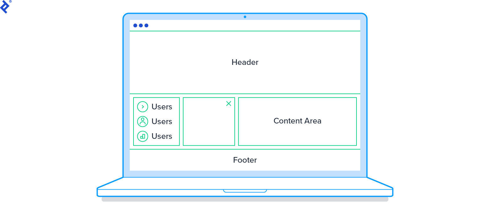
Let’s start by simply adding 5em to the width of the navigation menu when it’s expanded. We’ll do this by creating an “expanded” CSS class that we can dynamically add or remove from the navigation menu element:
#nav {
  left: 0;
  width: 5em;
  &.expanded {    /* Sass notation */
    width: 10em;
  }
}
Here’s an example of the JavaScript code (in this example, we use jQuery) that can be used to dynamically toggle the navigation menu between expanded and collapsed mode, based on the user clicking on the nav toggle icon:
$('.layout-classic #nav').on('click', 'li.nav-toggle', function() {
  $('#nav’').toggleClass('expanded');
});
And with that, our nav menu can now dynamically be expanded or collapsed. Great.
Well, sort of great, but not quite. Although the nav menu can now expand and contract, it doesn’t play well with the rest of the page. The expanded nav menu now overlaps the subnav which is definitely not the desired behavior.
This reveals one of the key limitations of CSS2; namely, there is way too much that needs to be hardcoded with fixed position values. As a result, for the other elements on the page that need to be repositioned to accommodate the expanded nav menu, we need to define additional “expanded” CSS classes with yet more fixed position values.
#subnav {
  left: 6em;
  width: 13em;
  &.expanded {
    left: 11em;    /* move it on over */
  }
}

#main {
  margin: 6em 0 4em 20;
  z-index: 10;
  &.expanded {
    margin-left: 25em;    /* move it on over */
  }
}
We then need to extend our JavaScript code to add dynamic adjustment of these other elements as well when the nav toggle is clicked by the user:
$('.layout-classic #nav').on('click', 'li.nav-toggle', function() {
  $('#nav, #subnav, #main').toggleClass('expanded');
});
OK, that works better.
Layout Variations Using Classic CSS2 Techniques
Now let’s address the requirement of having some pages that hide the sub nav menu. Specifically, we want the sub nav menu to be hidden when the user clicks the “users” icon in the main nav area.
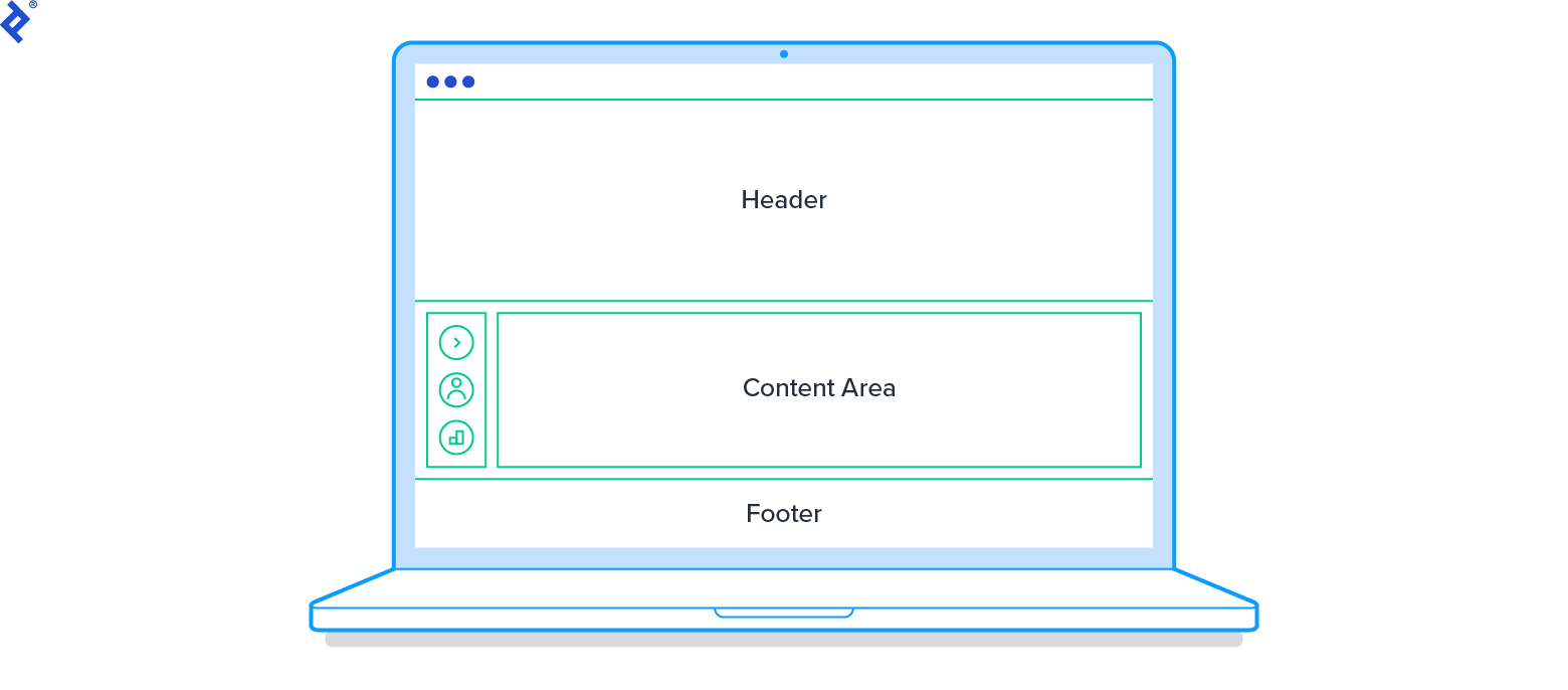
So first, we’ll create a new class “hidden” that applies display: none:
.hidden {
  display: none;
}
And again, we’ll use JavaScript (jQuery) to apply the “hidden” CSS class to the #subnav element when the user clicks the users icon:
$('#nav.fa-user').on('click', function() {
  $('#subnav').toggleClass('hidden');
});
With this addition, the #subnav element gets properly hidden when the user clicks on the “users” icon, but the space it had occupied remains unused, rather than the other elements expanding to use the space vacated by the #subnav element.
In order to get the desired behavior when we hide the #subnav element, we’ll employ one of the lesser known, yet highly useful, CSS selectors known as the adjacent sibling selector.
Adjacent Sibling CSS Selector
The adjacent sibling selector allows you to specify two elements, selecting only those instances of the second element that immediately follow the specified first element.
For example, the following will select only those elements with the ID main that immediately follow an element with the ID subnav:
#subnav + #main {
  margin-left: 20em;
}
The above CSS snippet sets the left margin of #main to 20emif and only if it immediately follows a displayed#subnav.
However, if #nav is expanded (which causes the expanded class to be added to #main as well, based on our earlier code), we move the left margin of #main to 25em.
#subnav + #main.expanded {
  margin-left: 25em;
}
And, if #subnav is hidden, we move the left margin of #main all the way over to 6em to be right next to #nav:
#subnav.hidden + #main {
  margin-left: 6em;
}
(Note: One disadvantage of using the adjacent sibling selector is that it forces us to always have #subnav present in the DOM, regardless of whether or not it’s being displayed.)
Finally, if #subnav is hidden and #nav is expanded, we set the left margin of #main at 11em:
#subnav.hidden + #main.expanded {
  margin-left: 11em;
}
This enables us to wire things up together without any heavy JavaScript code, but we can also see how complicated this code can become if we add more elements to the page. We see yet again that, with CSS2, lots of hardcoding of position values is needed in order to get things to work properly.
Leveraging CSS3
CSS3 offers significantly enhanced functionality and layout techniques that make it much easier to use and much less reliant on hardcoded values. CSS3 is inherently designed to support more dynamic behavior and is, in that sense, more “programmable”. Let’s examine some of these new capabilities as they relate to our use case.
CSS3 calc() Function
The new CSS3 calc() function can be used to calculate CSS property values dynamically (note, though, that support varies across browsers). The expression provided to the calc() function can be any simple expression combining the basic arithmetic operators (+, -, *, /) using standard operator precedence rules.
Use of the calc() function can help avoid much of the hardcoding of values required by CSS2. In our case, this enables us to achieve CSS expansion more dynamically. For example:
#nav, #subnav {
  position: fixed;
  height: calc(100% - 10em); /* replaces */
  z-index: 20;
}
With the above height specification using the calc() function, we achieve the same result as we did in CSS2 with top:6em and bottom:4em, but in a much more flexible and adaptive way, and without needing to hardcode top and bottom position values.
CSS3 Flexbox Layout
Flexbox is a new layout introduced in CSS3 (support varies across browsers). The flexbox layout makes it simpler to arrange elements on a page in a way that behaves predictably across different screen sizes, resolutions, and devices. It is therefore particularly useful in the context of responsive web design.
Key features include:
- Positioning child elements is much easier and complex layouts can be achieved more simply and with cleaner code.
- Child elements can be laid out in any direction and can have flexible dimensions to adapt to the display space.
- Child elements automatically expand contract to adapt to available free space.
Flexbox introduces its own unique set of terms and concepts. A few of these include:
- Flex container. An element with its
displayproperty set toflexorinline-flexwhich serves as the container element for flex items. - Flex item. Any element within a flex container. (Note: Text directly contained in a flex container is wrapped in an anonymous flex item.)
- Axes. Every flexbox layout has a
flex-direction that designates the main axis along which the flex items are laid out. The cross axis is then the axis perpendicular to the main axis. - Lines. Flex items can be laid out on either a single line or on several lines according to the
flex-wrapproperty. - Dimensions. The flexbox equivalents of height and width are
main sizeandcross size, which specify the sizes of the main axis and cross axis of the flex container, respectively.
OK, so with that brief intro, here’s the alternative markup we can use if we’re using a flexbox layout:
<body class="layout-flexbox">
  <header id="header"></header>
  <div class="content-area">
      <nav id="nav"></nav>
      <aside id="subnav"></aside>
      <main id="main"></main>
  </div>
  <footer id="footer"></footer>
</body>
For our example use case, our main layout (header, content, footer) is vertical, so we’ll set our flexbox up to use a column layout:
.layout-flexbox {
  display: flex;
  flex-direction: column;
}
Although our main layout is vertical, the elements in our content area (nav, subnav, main) are laid out horizontally. Each flex container can define only one direction (i.e., its layout must either be horizontal or vertical). Therefore, when the layout requires more than this (a common case being for an app layout), we can nest multiple containers one inside the other, each with a different directional layout.
That’s why we’ve added an extra container (that I’ve called the content-area) wrapping #nav, #subnav, and #main. This way, the overall layout can be vertical, while the content area’s contents can be laid out horizontally.
Now in order to position our flex items we are going to use the property flex that is a shorthand for flex: <flex-grow> <flex-shrink> <flex-basis>;. Those three flex properties are the ones that determine how our flex items distribute any free space remaining between them in the flow direction, as follows:
- flex-grow: specifies how much an item can grow relative to the rest of the flexible items inside the same container
- flex-shrink: specifies how an item can shrink relative to the rest of the flexible items inside the same container
- flex-basis: specifies the initial size of an item (i.e., before it shrinks or grows)
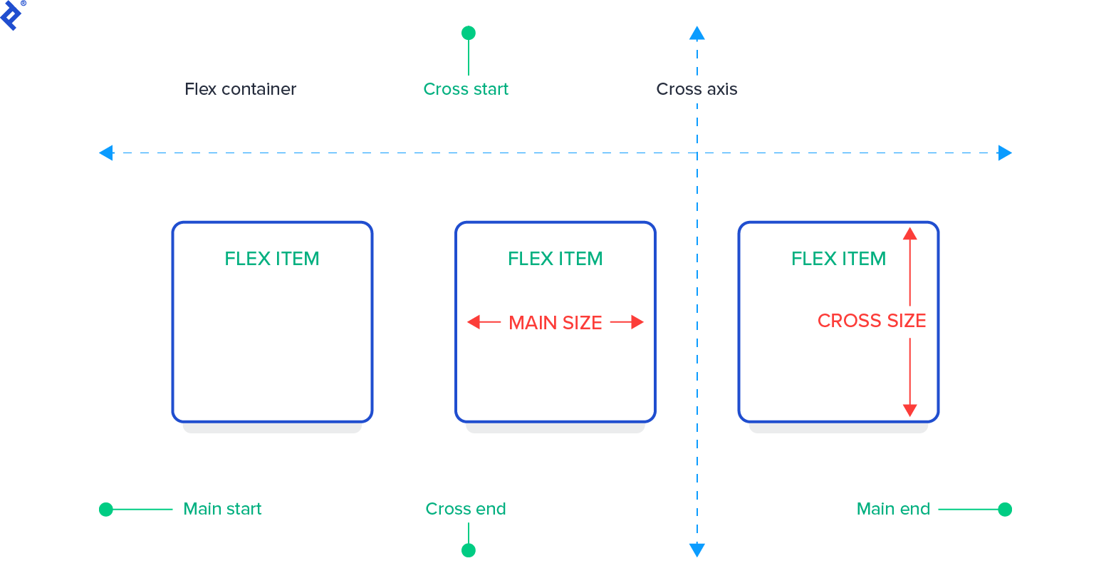
Setting flex-grow and flex-shrink both to zero means that the size of the item is fixed and it will not grow or shrink to accommodate there being more or less free space available. This is what we do for our header and footer since they have a fixed size:
#header {
  flex: 0 0 5em;
}

#footer {
  flex: 0 0 3em;
}
To have an item take all available free space, set its flex-grow and flex-shrink values both to 1 and set its flex-basis value to auto. This is what we do for the content area since we want it to take up all available free space.
And as we stated before, we want the items inside content-area to lay out in row direction, so we’ll add display: flex; and flex-direction: row;. This makes content-area a new flex container for #nav, #subnav and `#main.
So here’s what we end up with for the CSS for content-area:
.content-area {
    display: flex;
    flex-direction: row;
    flex: 1 1 auto; /* take up all available space */
    margin: 1em 0;
    min-height: 0; /* fixes FF issue with minimum height */
}
In the content area, both #nav and #subnav have fixed sizes, so we just set the flex property accordingly:
#nav {
  flex: 0 0 5em;
  margin-right: 1em;
  overflow-y: auto;
}

#subnav {
  flex: 0 0 13em;
  overflow-y: auto;
  margin-right: 1em;
}
(Note that I’ve added overflow-y: hidden to these CSS specifications to overcome content exceeding and overflowing the container height. Chrome actually does not need this but FireFox does.)
#main will take up the rest of the free space:
#main {
  flex: 1 1 auto;
  overflow-y: auto;
}
This all looks good, so now let’s add our dynamic behavior to this and see how that goes.
The JavaScript is identical to what we had before (except here, the CSS element container class we’re specifying is layout-flexbox whereas before it was layout-classic):
$('.layout-flexbox #nav’).on('click', 'li.nav-toggle', function() {
  $('#nav').toggleClass('expanded');
});
We add the expanded class to CSS as follows:
#nav {
  flex: 0 0 5em; /* collapsed size */
  margin-right: 1em;
  overflow-y: auto;
  &.expanded {
    flex: 0 0 10em; /* expanded size */
  }
}
And voila!
Note that this time we don’t need to let other items know about the width change, since the flexbox layout handles all of that for us.
The only thing left then is hiding the sub nav. And guess what? That “just works” too, without any additional changes, using the same JavaScript code as before. Flexbox knows about free space and it automatically makes our layout work with no extra code. Pretty cool.
Flexbox also provides some interesting ways of centering both vertical and horizontal elements. We realize here how important it is for a presentational language to include the notion of free space and how scalable our code can become using these sorts of techniques. On the other hand, the concepts and notation here can take a bit more to master than classic CSS.
CSS3 Grid Layout
If the Flexbox Layout is at the leading edge of CSS3, then Grid Layout might be said to be at its bleeding edge. The W3C specification is still in a draft state and it still has fairly limited browser support. (It’s enabled in Chrome through the “experimental Web Platform features” flag in chrome://flags).
That said, I personally don’t consider this draft revolutionary. Rather, as the HTML5 design principles state: “When a practice is already widespread among authors, consider adopting it rather than forbidding it or inventing something new.”
Accordingly, markup-based grids have been used for a long time, so now the CSS Grid Layout is really just following that same paradigm, offering all of its benefits and much more in the presentation layer with no markup requirements.
The general idea is to have a predefined, fixed, or flexible grid layout where we can position our elements. Like the flexbox, it also works on the free space principle and allows us to define both vertical and horizontal “directions” in the same element, which brings advantages in code size and flexibility.
Grid layout introduces 2 types of grids; namely, explicit and implicit. For simplicity, we’re going to focus on explicit grids in this.
Like flexbox, Grid layout introduces its own unique set of terms and concepts. A few of these include:
- Grid container. An element with its
displayproperty set to “grid” or “inline-grid” into which the contained elements are laid out by positioning and aligning to a predefined grid (explicit mode). The grid is an intersecting set of horizontal and vertical grid lines that divide the grid container’s space into grid cells. There are two sets of grid lines; one for defining the columns and one orthogonal to it for defining the rows. - Grid track. The space between two adjacent grid lines. Each grid track is assigned a sizing function, which controls how wide or tall the column or row may grow, and thus how far apart its bounding grid lines are.
- Grid cell. The space between two adjacent row and two adjacent column grid lines. It is the smallest unit of the grid that can be referenced when positioning grid items.
- Flexible length. A dimension specified with the
frunit, which represents a fraction of the free space in the grid container.
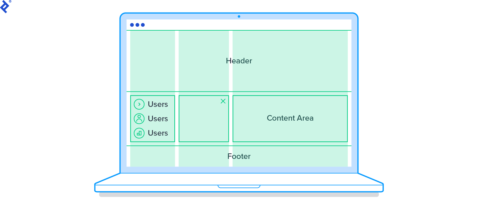
Here’s the alternative markup we can use if we’re using a Grid layout:
<body class="layout-grid">
  <header id="header"></header>
  <nav id="nav"></nav>
  <aside id="subnav"></aside>
  <main id="main"></main>
  <footer id="footer"></footer>
</body>
Note that with this layout, we do not need an extra wrapper for the content area as we did for the flexbox, since this type of layout allows us to define element space designation in both directions in the same grid container.
Let’s dig into the CSS now:
.layout-grid {
  display: grid;
  grid-template-columns: auto 0 auto 1em 1fr;
  grid-template-rows: 5em 1em 1fr 1em 3em;
}
We’ve defined display: grid; on our container. The grid-template-columns and grid-template-rows properties are each specified as a list of spaces between grid tracks. In other words, those values are not the position of the grid lines; rather, they represent the amount of space between two tracks.
Note that the measurements units can be specified as:
- a length
- a percentage of the grid container’s size
- a measurement of the contents occupying the column or row, or
- a fraction of the free space in the grid
So with grid-template-columns: auto 0 auto 1em 1fr; we will have:
- 1 track defining 2 columns of
autowidth (#navspace) - 1 gutter of 0 (the margin for
#subnavis at the element level, as it can be present or not, this way we avoid having double gutter) - 1 track defining 2 columns of
autowidth (#subnavspace) - 1 gutter of
1em - 1 track using
1frfor#main(will take all remaining space)
Here we heavily use the auto value for the track, which allows us to have dynamic columns where the position and size of lines are defined by their maximum content. (We will therefore need to specify the sizes for the #nav and #subnav elements, which we’ll do shortly.)
Similarly, for the row lines we have grid-template-rows: 5em 1em 1fr 1em 3em; that sets our #header and #footer to be fixed and all elements between to use the remaining free space while using 1em gutters.
Now let’s see how we place the actual elements to be positioned into our defined grid:
#header {
  grid-column: 1 / 6;
  grid-row: 1 / 2;
}

#footer {
  grid-column: 1 / 6;
  grid-row: 5 / 6;
}

#main {
  grid-column: 5 / 6;
  grid-row: 3 / 4;
  overflow-y: auto;
}
This specifies that we want our header to be between grid line 1 and 6 (full width), and between grid lines 1 and 2 for our rows. Same for footer, but between last two lines (rather than first two). And the main area is set appropriately for the space it is supposed to occupy.
Note that the grid-column and grid-row properties are shorthand for specifying grid-column-start / grid-column-end and grid-row-start / grid-row-end, respectively.
OK, so back to the #nav and #subnav. Since we previously placed #nav and #subnav into the track with auto values, we need to specify how wide these elements (same for the expanded mode, we just change its width and the Grid Layout takes care of the rest).
#nav {
  width: 5em;
  grid-column: 1 / 2;
  grid-row: 3 / 4;
  &.expanded {
    width: 10em;
  }
}

#subnav {
  grid-column: 3 / 4;
  grid-row: 3 / 4;
  width: 13em;
  /* track has gutter of 0, so add margin here */
  margin-left: 1em;
}
So now we can toggle our #nav and also hide/remove the #subnav and all works perfectly! Grid layout also allows us to use aliases for our lines, so eventually changing grids won’t break out code as it’s mapped to a name and not a grid line. Definitely looking forward to this being more widely supported by more browsers.
Conclusion
Even with classic CSS techniques, there’s much more that can be accomplished than many web developers realize or take advantage of. That said, much of this can be quite tedious and can involve hardcoding of values repeatedly throughout a style sheet.
CSS3 has begun to deliver much more sophisticated and flexible layout techniques that are significantly easier to program and that avoid much of the tedium of prior CSS specifications.
Mastering these techniques and paradigms – both for CSS2 and CSS3 – is essential to leveraging all that CSS has to offer in order to optimize both the user’s experience and the quality of your code. This article really just represents the tip of the iceberg of all there is to learn and all that can be accomplished with the power and flexibility of CSS. Have at it!
Thank you again Toptal.com for allowing us to share this incredible, informative post.


