 1-888-553-8776
 Eashan Mehta
Mobile shopping is no longer the future—it’s the present. With over 60% of online purchases now happening on mobile devices , having a flawless mobile experience isn’t just a luxury, it’s a necessity. Yet, many eCommerce businesses unknowingly drive customers away because their mobile sites are slow, clunky, or difficult to navigate.
A poor mobile experience doesn’t just frustrate customers—it directly impacts conversion rates, search rankings, and revenue. Many store owners don’t realize that their mobile usability issues are the reason they’re missing out on sales.
If you want to maximize conversions, reduce bounce rates, and create a frictionless shopping experience, your mobile store needs to be fast, responsive, and intuitive. In this guide, we’ll go beyond the obvious fixes and introduce both simple and advanced strategies to help you optimize your mobile eCommerce store.
By the end of this blog, you’ll have actionable solutions that can instantly improve your mobile experience and unlock the sales potential that poor mobile performance has been holding back.
Prioritize Mobile Page Speed and Performance
Nothing kills a mobile shopping experience faster than a slow-loading website. If your mobile store takes more than three seconds to load, over 50% of visitors will abandon it. Page speed doesn’t just affect user experience—it’s a ranking factor for Google, meaning a slow mobile site will also hurt your SEO and organic traffic.
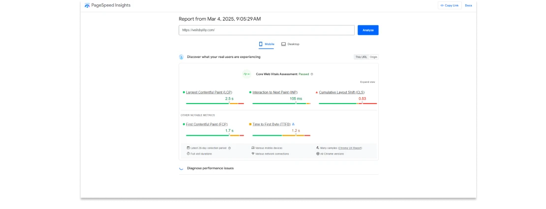 VeilsByLily Mobile Page Speed Performance
The simplest way to improve mobile speed is by compressing images, enabling lazy loading, and minimizing unnecessary code. Large, unoptimized images are one of the biggest culprits of slow load times. Using WebP image formats and setting up responsive image scaling ensures your images look crisp while loading as fast as possible.
Another hidden speed killer is third-party apps and scripts. Many eCommerce stores install dozens of plugins and tracking codes that bloat the site and slow it down. Audit your mobile store’s scripts, analytics, and tracking tools, and remove anything unnecessary.
A more advanced strategy is implementing a content delivery network (CDN), which caches your site’s content on multiple servers worldwide. This drastically reduces load times by serving content from the closest server to your customer’s location.
Rethink Mobile Navigation for Simplicity and Speed
Many eCommerce stores don’t realize that their desktop navigation doesn’t translate well to mobile. What works on a big screen with a mouse may feel clunky, overwhelming, or frustrating on a smaller touchscreen.
A mobile-optimized site should minimize clicks and make it effortless to find products. The best way to achieve this is by implementing a sticky navigation bar, keeping essential functions (menu, search, cart) always accessible.
 Example of Mobile Navigation
Dropdown menus can be problematic on mobile, so consider collapsing categories into an expandable menu instead. Large, thumb-friendly buttons improve usability, ensuring users can tap precisely without frustration.
A hidden gem that many businesses overlook is predictive search and dynamic search. A smart, AI-powered search bar that auto-suggests products based on user input can drastically speed up the shopping process. Predictive search helps customers find relevant products as they type, while dynamic search goes a step further by automatically generating search results based on browsing behavior, purchase history, and site content. This ensures that users see highly relevant products without having to manually filter through categories. Instead of forcing customers to dig through multiple pages, let AI-powered search tools do the heavy lifting, creating a seamless, personalized shopping experience.
Optimize the Checkout Process for Mobile Users
A frustrating checkout process is one of the biggest reasons for cart abandonment on mobile. If a customer struggles with input fields, slow load times, or a confusing layout, they’ll leave before completing their purchase.
One of the simplest but most effective fixes is implementing one-page checkout. Reducing the number of steps it takes to complete a purchase makes the process feel effortless.
Autofill and mobile-friendly input fields speed up checkout significantly. Enable Google Pay, Apple Pay, and Shop Pay, allowing customers to checkout without manually entering their details.
A lesser-known strategy is enabling biometric authentication for faster logins and purchases. Allowing customers to log in and pay with Face ID or fingerprint authentication reduces friction and speeds up the process.
Improve Mobile Product Pages for Better Engagement
Many eCommerce businesses assume their product pages look fine on mobile—until they actually test them. Product pages designed for desktop often appear cluttered, difficult to read, or hard to navigate on mobile screens.
 Example of Mobile Navigation
A great mobile product page should be visually clear, easy to scroll, and highly interactive. Use high-quality product images that can be zoomed in without pixelation, and ensure product videos autoplay in a muted format so they don’t disrupt the experience.
Leverage Personalization to Create a Better Mobile Shopping Experience
Personalization is one of the most overlooked yet powerful strategies for improving the mobile shopping experience. Mobile shoppers expect quick, relevant, and seamless interactions with an eCommerce site. If your store isn’t tailoring its content, recommendations, and promotions to individual users, you’re likely missing out on conversions.
A well-optimized mobile store should adapt to user behavior. Implementing dynamic product recommendations based on browsing history, past purchases, and preferences can make a huge difference.
Final Thoughts on Mobile Optimization for E-Commerce
The mobile experience of your eCommerce store isn’t just “nice to have”—it’s a direct factor in your store’s success. Many businesses struggle with low conversions simply because their mobile experience is broken, and they don’t even realize it.
By improving site speed, navigation, checkout usability, product page design, and mobile SEO, businesses can unlock massive revenue potential and ensure customers stay engaged.
At MAK Digital, we specialize in custom mobile optimization strategies that enhance user experience and drive real growth. If you’re ready to transform your mobile store into a high-performing sales machine, reach out today and let’s make it happen.


