Bootstrap is beloved by many. Well, if not “beloved”, then it is at least appreciated for what it is: a giant framework with almost everything you could need for building a site or web app interface. Bootstrap is changing, though.
That’s right, version four is in alpha release. Naturally, we’re just as curious to know what’s different, so I dived into the documentation to find out.
Keep in mind, though, that this is an alpha release. It cannot be considered feature-complete. It could radically change. It could become sentient and bring about The Singularity. You never know.
For now, it’s a fascinating (I’m fun at parties) look at the future of the most popular CSS framework out there.
This is obviously the biggest and most important change. Heck, you’ve probably already heard of it. People have gone so far as to procliam the “death of Less” due to this switchover.
Well, I don’t know if anything’s gone and died because the Bootstrap team decided to do things differently. It is, however, a monumental undertaking, and it will drastically change how people use and customize the framework.
Sass is just generally more developer-friendly, with wider support, a bigger community, and yes, more features. It can do some things that, right now, Less just can’t.
I say this with sadness. I’ve never made any secret of my love for Less; but it seems that the community at large has spoken, and declared that Sass is just, well, better. If you want to read the reasoning for this change for yourself, check out this discussion on Github.
Okay, we’ve been seeing the proliferation of card-based design for some time now. Bootstrap now has a specific component for them, with myriad layout options. You can group them up, keep them separate, add headers, footers, buttons, images, and overlay text on those images.
Wells, thumbnails, and panels all get replaced by the new card component, so in that way, Bootstrap is a bit more streamlined.
Figures are for showcasing single media objects (usually images), with an optional caption. Support for Bootstrap’s various helper classes is factored in, so you can align and style the image (and its caption) however you like.
Images placed in a figure element, given the right classes, become responsive automatically.
Now, due to lack of support, Flexbox has not replaced the regular grid system. However, it is available to anyone who wants it. Change a variable, recompile the Sass, and boom! You now have a new, modern layout system.
Bootstrap has historically been a bit of a pain to customize, aesthetically speaking:
There were a lot of styles to over-write, and individual variables to customize if you wanted to make your Bootstrap-based site look like anything other than a Bootstrap-based site. Heck, remember all of those customization apps made just for changing Boostrap’s look? Well the developers have heard your prayers and Github issues.
Change all of the transition animations at once, disable rounded corners, change all the colors, or anything else you like with one big bunch of Sass variables. It’s all there in the Reboot module, and it’s about time. We can expect some more original-looking designs now, with any luck.
That’s right, we’re moving away from pixels, to these relational units of measurement. This ties into the whole customization thing, too. Want a tighter design with thinner margins? Change the main text size, maybe a couple of variables, and boom. Everything looks “thinner”.
As you might expect, everything got re-written and upgraded. I mean, they moved to Sass. But still, the basic usage for most of these components will be the same.
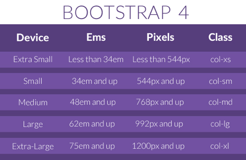
Do double-check the documentation, though. Certain things will have changed. Take the grid, for example: they added an “extra-large” tier to the grid system, presumably for those ridiculously huge retina screens that we’re seeing these days.
Alerts
Breadcrumb
Button dropdown
Button group
Buttons
Card
Carousel
Code
Collapse
Dropdowns
Forms
Images
Input group
Jumbotron
Label
List group
Modal
Navbar
Navs
Pagination
Popovers
Progress
Reboot
Scrollspy
Tables
The Grid
Tooltips
Typography
The proliferation of ES6 means that a lot of people are re-writing their JavaScript. This means performance improvements for all, the exodus of older browsers, and programmers having fun with new toys. It’s a win-win.
It’s about time. There’s not a whole lot more to say about that. Not much will change for most of us. Anybody who really, really needs to support legacy browsers will have to use an older version of Bootstrap.
Where Foundation is going “smaller” and more streamlined with specialized frameworks, Bootstrap seems to want it all. They have done a lot of work to improve performance, and streamline what they could, but Bootstrap still aims to do just about everything you can think of.
Mind you, anyone can configure their version of the framework however they like by dropping unnecessary modules, or adding new ones. It’s not a big deal. Still, there’s definitely a one-size-fits-all mindset in play.
And that can be a good thing. There are large, wide-scope projects out there that need the room to expand. In any case, Bootstrap will continue to satisfy its users’ needs. It’s going to be mostly the same, but better.


