When building a website, I prefer to start my code with a basic grid, and go from there. Call me picky, but I like having control over the design. However, there are certainly times when this just isn’t practical. If you’re building an app, or an exceptionally large and complicated website, maybe you just don’t have the time to style every single element from scratch. The good news is that you really don’t have too, with the help of a complete CSS framework, it can help expedite the workflow and reduce the extra hassle. So, there has been a lot of articles written about the “Big name” frameworks(Bootstrap, Foundation, Gumby) but we’re not going to talk about those here. I started looking into some lesser known frameworks for the sake of being a contrarian, and I found some little know great frameworks!
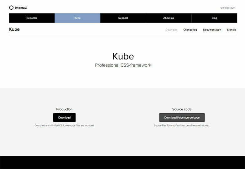
Kube is a solid tool for the modern front-end developer. Only modern browsers – and Internet Explorer 9 + are supported. The default styles are attractive, but bland enough to be adapted for any unique brand you’re working with. It’s a good looking framework, but plain enough to be used for any project you have. It’s very customizable and simple, as it is designed with near universal visual appeal, so it’s meant for heavy customization.
Features
When describing all the features in depth, or even to attempt to simply list them, would take up way to much space for this blog post, so we’ll give the highlights of the features. The framework itself is LESS-based, as well as modular. If you want everything except the button styles, its a very simple matter to compile your own. All you need to do is remove the corresponding @import rule from kube.less, and go! It’s safe to say that every HTML element has its own style element, and the usual extras like buttons, basic navigation bars, helper classes, and a very solid grid layout system.
In a sense, Kube is defined in part by what it doesn’t have. For example, it does not have an overabundance of UI elements and extra styles. There are no jQuery plugins for UI functionality whatsoever, and it certainly doesn’t come with the feeling that you are stuck with the design.
Conclusion
Kube is a solid framework and its creators certainly covered all the bases as far as the fundamentals go. However, there is a definite sense that it has “only what you need” when it comes to a framework, but not necessarily all the bells and whistles that others have. But overall, it’s a great place to start, and it does it’s purpose as a framework. We at MAK are impressed with it’s lightweight functionality and would recommend it.
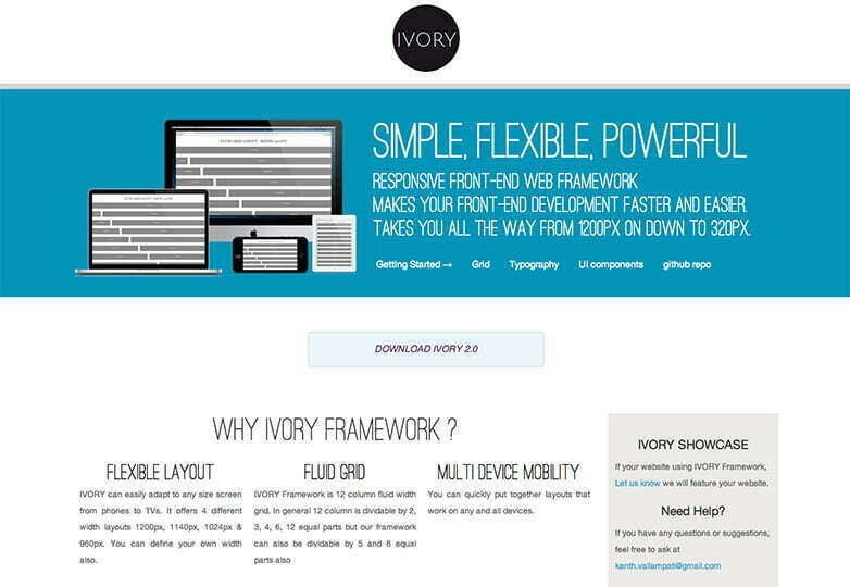
IVORY is similar to Kube in that it is designed to be understood easily and can be quickly installed and implemented. It has great typography, and is plain enough to fit into any project you might have for it, and the general default styles are similar. It’s a pretty bare bones framework as it gives just enough to get started, with a few extras.
The Features
The features are what you might expect from a normal framework: solid and flexible grid system, styles for forms and the typography, and so on. Where it sets itself apart, however, is that IVORY differs from Kube in that you are given some extras in the form of buttons, alert boxes, UI elements, pagination, toggle switches, tooltips, breadcrumb navigation, tabs, and accordions.
The great thing that differentiates these UI components apart from many others is that it’s all built with CSS3, and doesn’t need Javascript. The sole purpose of jQuery UI even being linked to at all is to make the date-picker work. There are just two parts of this framework that are questionable, and that is that some of the UI component styles are very reminiscent of Bootstrap 2, so you might want to change it. As well, the grid system requires the use of an exra class on the very last column of every row.
Conclusion
Besides those two minor inconveniences, the IVORY framework is a good option for any project you might be working on. It’s not the most customizable framework available, but it’s a basic framework just to get you started with the basics, as well as some nice extras.
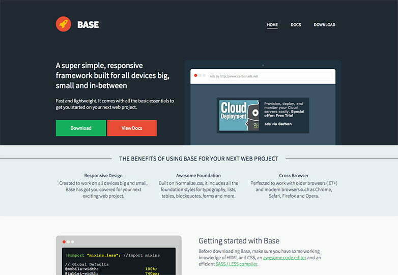
Base is a great framework, and is the most trendy and aesthetic framework of the three. It’s based on Normalize.css. It has flat boxes for buttons and thin heading fonts. There’s no denying that the default styles are downright attractive. This may not be for everyone, depending on how you plan on branding your website, but it’s simple to change and very easy to customize.
The Features
Base has both LESS and SASS versions it provides, so it’s easy to alter the variables and recompile it quickly to suit what you need, and the built in variables include break points, main container widths for each break point, font sizes, and much more. With plenty of extra classes, they provides for you to help set up your mobile-specific layouts, and there are “mixins” in a separate file to help you with your project. Somewhat similar to Kube, there are no extra UI components beyond the ones that come with HTML by default. If you want tabbed interfaces, accordions, and other components, you will have to make them yourself. Base seems to be geared more towards building beautiful websites as opposed to apps for the web.
Conclusion
If you’re project is a website that doesn’t need much app-specific UI components, then base is a great resource for your project. Pages built with it already look great, but if you aren’t feeling the default styles, it’s not difficult to change them.

